I finally had a chance to try out some stylized food photography while on a photo excursion. Styled food photography has become a new trend in the past year or so, and it was interesting to discover and test out some different ways on tackling this. I want to share with you my best tip when it comes to styled food photography which is changing the angle!
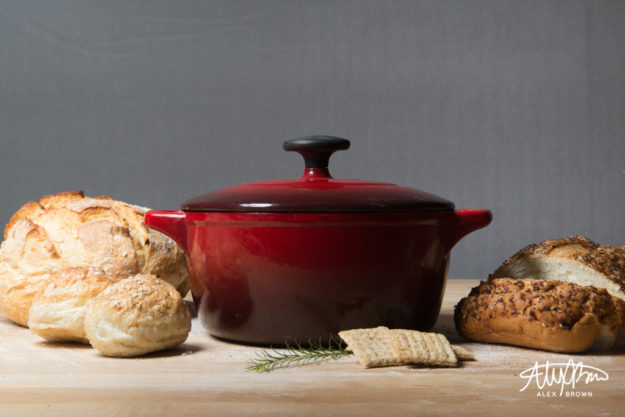
Straight On and Level
This angle creates a lot of shadow and gives the food depth. It also is the best for showcasing supporting items/ingredients in the background. The tabletop/counter isn’t as much as a focal point.

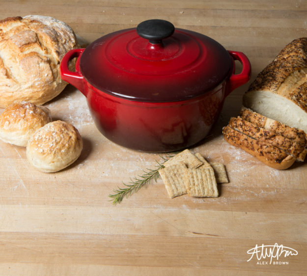
Bird’s Eye View
The reason I call this the bird’s eye view is because it reminds me of Bing Maps Bird’s eye view! This angle is good for showcasing the dimensional aspects of food. Furthermore, it helps viewers establish a spatial awareness of how big items are.
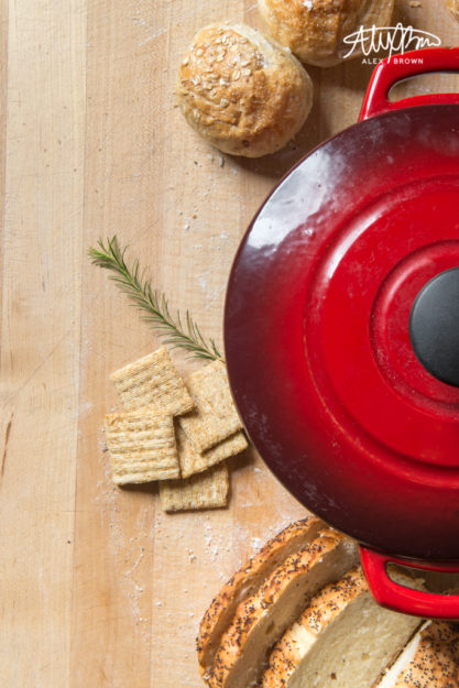
The Overhead
This style of food photography is probably the hero image of any stylized food photography shoot. When doing food photography, overhead shots are great because they allow you to see everything on the table and provide the most negative space if you need to include design elements. Furthermore, the image exudes simplicity and feels uncluttered.
When styling food photography, here are some tips that professional food stylists (yes, it’s a real thing) won’t tell you!


