I love product photography. It’s amazing what cool angles you are able to get and how interesting your shots can become by changing up lighting. What’s even cooler is when you take your product outdoors!
Harry’s is a really company that in the past year or two has taken off, revolutionizing the shaving world. But why should such a revolutionary product be taken on a plain white background? I set off to change that. While on my photo excursion, I took the family of Harry’s products and set them up on the back porch. I loved the way that this wood contrasted against the white box of the razor in addition to the dark teal bottles.
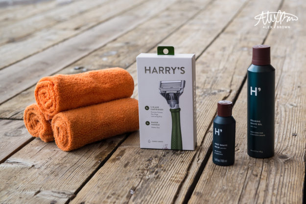
The Family Shot
Following standard design principles help improve photography! I chose to stylize this shoot with orange hand towels, which complement the steel teal of Harry’s brand.
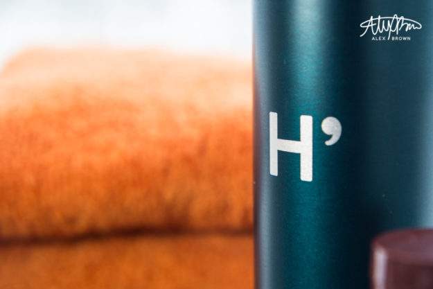
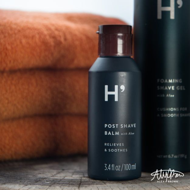
The texture of the deck is beautiful against this modern steel teal colored bottle contrasted with the orange towels.
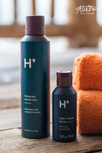
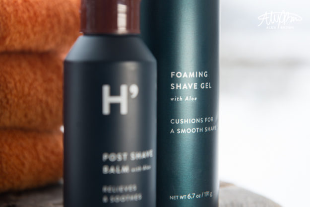
I love using Depth of field in product photography. This is one of my favorite shots because it’s perfect for Harry’s target market which is the social media savvy man (or woman). The depth of field combined with the lighting in this picture allows the customer to be able to read that they also have foaming shave gel.
For more stylized product photography, check out commercial photographer Paulius Musteikis. Also, check out Johngineer’s witty outdoor product photography.

Trackbacks/Pingbacks