An inside look into the process behind gig poster design
Gig Posters are pretty cool to design because they are unique to each city. Bands, Musicians and Artists would contract out to local artists/designers to design a special gig poster just for the one night they were in town. These gig posters would then be blanketed around town. The thing that makes a Gig Poster unique is that it has to convey a symbolic meaning while representing the style of music for the artist.
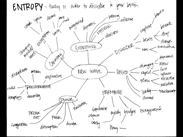
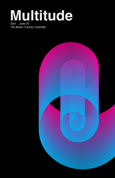
When I first started this project, I wanted to create a gig poster for a punk/new wave band since that happens to be one of my favorite styles of music. However, as the project commenced, I started to alter that. My first iteration was quite simple in its nature and is reminscent of a club/dance/edm style of gig, something like Deadmau5 or even The Weeknd.
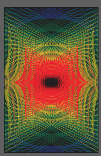
Things began to transform as I continued to continue to be bored in Illustrator. I knew I wanted to incorporate the blend tool since it’s so awesome, so I just started playing around with that. I ended up creating two triangles and blended them together, eventually continuing to layer them together. The result was this cool mouth-like effect.
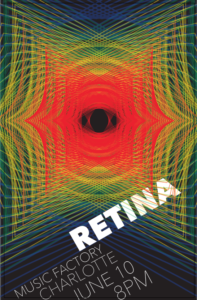
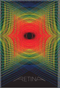
I felt that I was headed in a right direction, but it needed something more. I then rotated the center triangle and this created an eye! I love it. The first word that initially came to my mind was retina, and I started to play around with this, but I wasn’t feeling it.
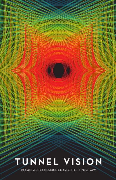
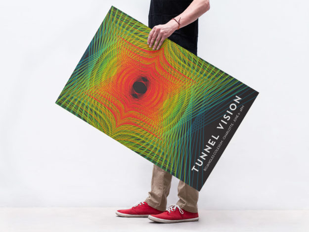
Then, randomly, as I was talking my mind out loud, just bouncing words and ideas out of my head, the name came to me… Tunnel Vision! I felt that this name fit the style of the poster – which is alternative. The thing I love about this is the progression of values towards the center. It suddenly gets more vibrant and more in your face.
If you want to take a look at more gig posters, check out these 80 amazing examples of Gig Poster Designs
