by Alex Brown | Feb 11, 2017

Photoshop is awesome when you have a great tagline for an advertisement in mind but no means to make a photoshoot happen!
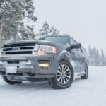
I created this photoshop composite advertising the Ford Expedition. I drove one for a day on a recent photo excursion in Grand Teton National Park. I’m a car guy so I was surprised on how well it drove!
When we stopped to use the restroom, I was just walking around and admiring the car! I decided to take out my camera and tripod and get an awesome shot of this expedition! It was in a natural environment and I thought it looked great.
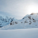
I knew I wanted to create an ad for the Expedition when I had the challenge to create a photoshop composite, so I decided to theme it around the winter months. I love remote mountain scenes, and when you put a skier or snowboarder in it, it makes it even more amazing! I had the story!
After finding the images I wanted, I brought them all together in photoshop where I blended the Expedition into this mountain scene and adjusted the coloring. To add that final touch, I put the snowboarder on the mountain and used the spot healing brush to clear the rocks out of his path (this is realistic, right?).
With the photo done, I then brought it into Illustrator where I added the text following Ford’s current advertising creative direction and dropped in that witty tagline that completes the story told by this composite!


by Alex Brown | Feb 10, 2017
How an ordinary day with an ordinary item turned into amazing abstract artwork.
Scanography: The process of capturing digitized images of objects for the purpose of creating printable art using a flatbed “photo” scanner with a CCD (charge-coupled device) array capturing device.
Prior to this activity, I’ve never used a scanner to create artwork. I have never even thought about using it as a method to create art. However, it’s amazing what results you can get with a scanner!
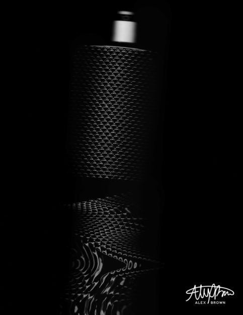
When I was thinking about what I could create with my scanner, I knew I wanted it to be abstract enough to become fine art. I have an HP Officejet 7500A, which sits on the ground in my room underneath my shelves since it’s so dang big (it can print up to 13×19). Right above the printer, I have all my cologne out on a shelf. I looked up and saw my bottle of James Bond 007 Black cologne and knew that it would be awesome with a scanner. I’ve taken some cool pictures of this bottle before, but I wanted to see how the light of the scanner would affect the texture/pattern on the bottle when it was moving.
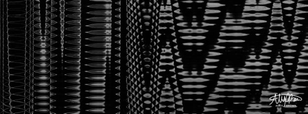
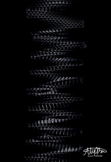
From the thirty different scans I actually committed to (I used the overview function a lot), I liked these four the best.

Graduated Texture
I love this first scan because of the graduated texture. Even though the texture of the bottle is all the same, by adjusting the speed and movement at which I moved the bottle on the bed created these variations in texture.

Snake Skin

Product Scanography
Who ever knew that you could pull of product photography with a scanner?

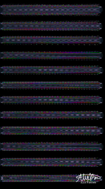
Science Tubes
When you play around with the scanner settings, specifically color settings it’s interesting to see what you end up with!
by Alex Brown | Jan 28, 2017
When the avgeek, photographer, and designer in me come together to recreate the movie poster for “Sully”.
Design and photography are essential to movie posters. Both of these being my passions, I needed to think of something else in my life that I absolutely love. And then the ah-ha moment came… AVIATION! Yes, it’s a little weird, not gonna lie. I’m that one crazy person who will connect in Atlanta in order to fly on an international aircraft instead of flying nonstop. Now, it was trying to find the right movie to depict.
Recently, Sully, the movie came out. I still haven’t seen it, but I remember that night exactly. It was a January night when a flock of geese took out both engines of US Airways flight 1549. After 208 seconds after taking off from New York’s LaGuardia airport, Captain Sully Sullenberger made the decision to ditch his Airbus A320 aircraft, along with 155 people on board, into the freezing waters of the Hudson. I remember this night very well. We were on our way home after going to Costco. We had just gotten back on Independence Blvd. in Charlotte and my dad turned up the radio. I wasn’t exactly sure what happened, so the minute I got home, I turned on the TV and watched the coverage from there.

Being an Avgeek, making an aviation movie poster meant that it not only had to be realistic but most importantly it had to be accurate. Everything except for the tie and white shirt is apart of a real US Airways uniform that I acquired a few years back from a pilot friend. The uniform wasn’t the same one worn by crews at the time of the crash, however, it still is real!


Editing the Movie Poster
When it came to editing my poster, I wanted to keep it as realistic to the actual Sully movie poster itself as well as to the
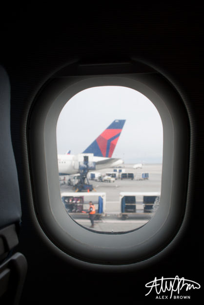
I decided to use my own picture of an airplane window I took a few years ago instead of using one from the internet. With the water and clouds, I used images from the Sully Movie website and reconstructed the layers in Photoshop. After doing some simple retouching, I removed the background on my self-portrait and placed it in my poster.
The wings were too difficult to get a hold of, so I was able to find a high-quality picture of them from StanWings.com, an aviation wings website, and photoshopped them on the jacket. The hardest thing about this part was the fact that the new uniforms from US Airways all had silver badges and accents, instead of the gold that are on mine, so I also spent a lot of time photoshopping the wings to make them match the hat.
After finishing my photo, I then went into Illustrator, where I put together the text of the poster. I chose to rename the movie “Brace for Impact” because first off I’m not Sully, but second off it was the words heard from the cockpit before the plane went down.
Here are the direct links to images used from the internet: http://www.sully-movie.com/img/plax-bkg/desk-land_plax_0.png, http://www.sully-movie.com/img/plax-bkg/desk-land_plax_3.png, http://www.sully-movie.com/img/plax-bkg/desk-land_plax_1.png, http://www.sully-movie.com/img/plax-bkg/desk-land_plax_clouds.jpg, http://www.stanwing.com/wings/u/usair/USAir_28-Supervisory%20Captain%20Wing%208th%20Issue.jpg
by Alex Brown | Jan 21, 2017
Instead of thinking about life through a lens, start living it; Capturing amazing moments of real life with street photography and still life photography.
Think of your daily route to work or school. You do it so often it becomes boring and ordinary. I know there have been times when I’ve noticed something and I’ve contemplated whether or not it’s new or if something has changed. Most likely, it probably it hasn’t.
I was challenged to merge my ordinary real life with my creative mind in something called OS-ES. After attending a conference and workshop, photographer and visual communications professor Caryn Esplin was amazed by the work of Roberto Valenzuela – specifically how he was able to take an ordinary spot and turn it into an extraordinary shot (OS-ES).
Street Photography
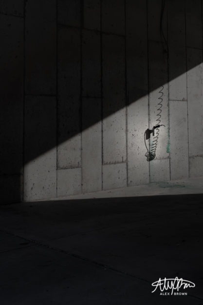
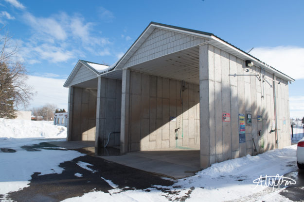
Living in Idaho, urban and street photography is something that is somewhat hard to come by. As I was driving around Eastern Idaho, I came by this ordinary spot and was fascinated by how the light created abstract shadows against these concrete walls. You’re going to have to wait to see the ordinary spot, but here’s the extraordinary shot I got:

Extraordinary Shot
What I love most about this image is how thoughtful and contemplative it is. It’s conceptual in nature. I took this shot with the intent of making the viewer try to think about exactly what it is. Not only did this remind me of my Eucalyptus Euphoria project, it reminded me of what the great street photographer, Eric Kim, mentions in his guide to street photography:
Not all street photography needs to be super emotional. Some street photographs are purely visual images– that appeal to our sense of geometry, composition, and composition. These images are generally shot in good light with nice lights and shadows, have strong diagonal lines, leading lines, curves, and shapes of interest
Still Life Photography
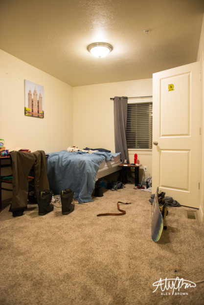
Still life photography is a lot like street photography, except you capture the emotion and pause the life of inanimate objects. I thought a lot about how I could get an extraordinary shot out of an ordinary spot. I think because of this, I tended to overthink it. After changing out my camera battery, I was just browsing in my room and I noticed not only how the light from the window was hitting my roommate’s bed, but also how he “set” his covers up before he went boarding this morning.

Ordinary Spot

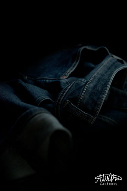
Extraordinary Shot
With photography, my favorite angle is the lowest angle possible. So, when I got lower and closer to his bed, I noticed his pair of jeans on the floor. And then the creativity happened with this shot. Who knew an ordinary pair of jeans could turn in to such a dramatic still life photograph?! (I guess he now has an excuse for not picking his clothes up off the floor.)
Oh… before I forget. Here’s the ordinary spot of the first picture. Also, check out Megan Graham’s challenge with OS-ES.

Ordinary Spot
by Alex Brown | Jan 14, 2017
How to turn an everyday male headshot into a billboard-ready, fashion photograph using lighting patterns and high-end retouching
Headshots are often seen as and perceived as girly and glamorous: Hours of makeup followed by hours of hair, and in the end there aren’t really any shots that she loves. When it comes to photographing male headshots, simplicity is key. The goal of a photographer is to balance the light. When taking male headshots, the simple application of standard lighting patterns can make the difference between not or HOT! If you combine these lighting patterns with some post production high-end retouching, your male headshot steps it up a level, becoming billboard ready!
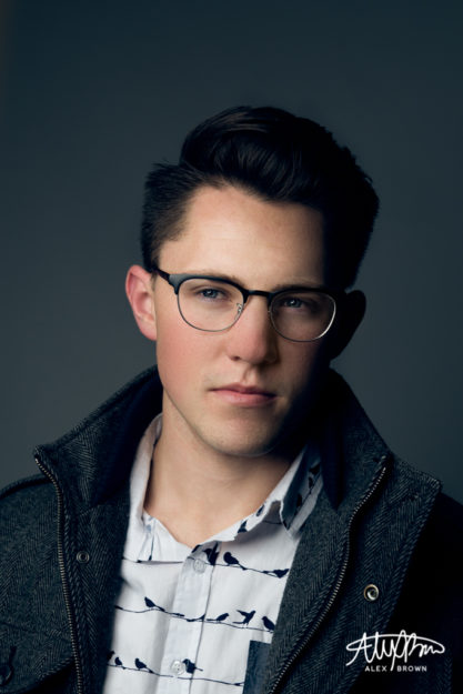
With any headshot, good auxiliary lighting is key. For all the male headshots below, I used an Einstein strobe with a beauty dish and a diffuser cover. By using a beauty dish, we get the beautiful circular outlined catch light in the eyes!

Loop Lighting
Named after the shadow loop underneath and to the side of the nose, Loop lighting is one of the most typical lighting patterns because it achieves a flattering look while at the same time creating depth. To take this photo a step above and beyond, I did some high end retouching to help even out the complexion and shadows on the skin, creating even better contrast with the glasses. Eyewear photographers, watch out! For more examples of high end retouching check out my buddy Gerardo Sumano, who is an expert at high end fashion photography and retouching!

Rembrandt Lighting
Rembrandt lighting is lighting that features a triangle underneath the eye on the short side of the light.

Split Lighting
Split lighting is where one side of the face is lit while the other is dark.
by Alex Brown | Jan 14, 2017
Create dramatic photographs with a simple lighting technique that results in low key portraits and epic photographs
Epic. Dramatic. Softness. These are just a few adjectives that describe low key photography. Before shooting for this post, I’ve always had a fascination with any photographs that had a white background or were high key. Not only are photographs with a white background clean and sterile, they don’t distract from the subject. However, once you go black, you don’t go back.
Chiaroscuro and Key Values
Value is an elemental term in visual arts that relatively describes the amount of lightness or darkness that is present in a photograph or piece of artwork.
When we say the term low key we are describing a piece that is darker in it’s toning, coloring which creates a more dramatic, moody and emotional photograph or work. When an image is high key, overall the work is lighter and brighter creating a more simplistic and peaceful photograph or work.
During the Renaissance and Baroque periods, painters struggled with how to successfully translate a three-dimensional object onto a flat surface. In order to solve this problem, painters instituted a technique called Chiaroscuro, meaning light (chiaro) and dark (scuro). This technique resulted in high-contrast paintings that were dramatic and powerful. Take a look at some of Flickr’s top Chiaroscuro picks here.
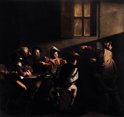
Highlight of History: Caravaggio

Source: Web Gallery of Art
Caravaggio was a Baroque Italian painter who made the chiaroscuro style famous. Most of his works feature a dark background and are highly contrasted with his subjects, which where illuminated intensely or dimly.
Caravaggio’s piece, The Calling of Saint Matthew, exemplifies his strong use of and attention to light and value. Caravaggio creates a strong dramatic image with the soft lighting from the beam shining into the room which creates a deep contrast between the variations of textures and colors. Overall, more rich and deep tones result in a low-key value.
Studio Quality Lighting with an Invisible Black Backdrop
Photographer Glyn Dewis has formulated a technique that allows any photographer, no matter where they are, to shoot on an invisible black backdrop with camera settings and a speedlight. The end result is a beautiful photograph with studio quality lighting and a subject against a black backdrop.
Depending on how the light is controlled, images shot with this technique can vary in value, however they are primarily low key images as the background is black. When shooting this technique, the photographer is able to decide whether or not the subject is lit brightly, or if it’s dim. I personally prefer dimmer images as it tends to result in a more dramatic photograph.

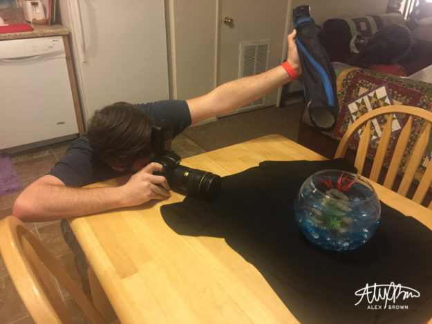
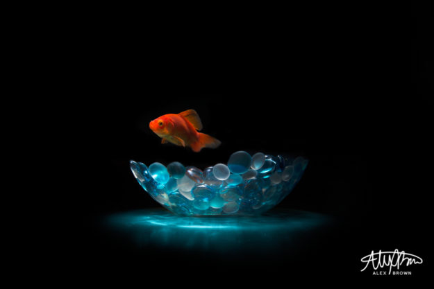
It’s amazing to see what everyday object you can take and turn into an amazing picture. Steven, who sits on my friends table, became a floating fish with this simple technique!

Low Key Portrait Photography
Low key portrait photography provides a dramatic and emotional look. When shooting low key portraits, you want to make sure that you have soft lighting.

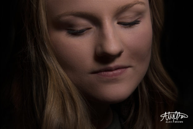
This was a picture I took of Baylie Madyson, a photographer and graphic designer here in Rexburg. This picture was taken in the corner of a room. I used my youngnuo speedlight with a large rouge flashbender and held it above her head. After playing around with the flash power, I finally landed this shot with amazing lighting. I love how the soft lighting turns this into an emotional photograph.
The soft lighting combined with Baylie looking down creates an emotional photograph, exuding grace, innocence and beauty. Furthermore, the soft light slowly feathers its way back, until it reaches the invisible black backdrop. I love how this has created a nice soft frame for her face while adding depth and drama.
You can learn more on how to shoot low key lighting on TutsPlus guide to shooting Low Key Lighting.
Epic Photographs with Black Backdrops
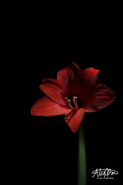
The invisible black backdrop technique also works great to achieve studio quality lighting for product and creative photography. Take for example this flower below.

When capturing this, the light was positioned above the flower and off a bit to the right. Because of this, the flower itself has a higher key value as it is brighter than the stem which is softly and subtly light. The reason why this is such an epic picture is because of the angle and composition of the photograph. By getting low, you are able to make objects seem more surreal, especially things like flowers which could easily be swallowed up by this black background.
