by Alex Brown | Feb 11, 2017
Creating watercolors with Photoshop is fast, easy and fun!
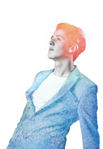
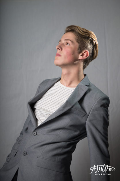
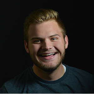
I had a lot of fun creating this watercolor piece in photoshop. I took this picture of Boston, a 15 year old model here in Rexburg, a few months ago at a shoot. When shooting this picture, I wanted to keep it simple. I love his facial expression and how he’s looking off to the left, but also his swagger in his stagger!

Creating watercolors in photoshop is way easier than I thought it would be. I started by following this tutorial, but eventually dropped off and started exploring on my own!
So you don’t have to watch the video, I’ll do a quick run through of what I did:
- Select and Mask the original photo so it would be against a white background
- Placed the image in a new document
- Desaturated the image 100%
- Added the Watercolor effect from the effect gallery
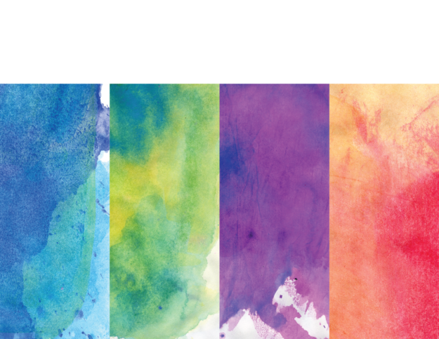
- Placed the blue watercolor image over my image with the screen blending mode
- Masked out with a brush the blue to only be on his suit
- Placed my orange and pink watercolor image on top with the lighten blending mode
- Masked out with a brush the orange to only be on his hair and then adjusted the opacity to slowly graduate off his face
I chose orange and blue since they are complementary colors and they looked awesome together! When placing the blue watercolor, I included more of the bright aqua tones at the top of his jacket because it was a much more vibrant contrast with the reds, oranges and pinks of the other watercolor in his hair!
Here is the original image of Boston that I used for this watercolor. I used the watercolor textures on a project a few years back so I can’t link to the original download anymore, but heres the file that I still do have and what I used!


by Alex Brown | Feb 11, 2017
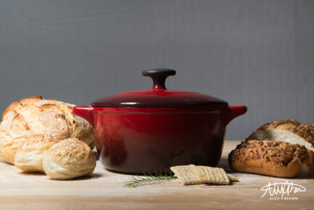
I finally had a chance to try out some stylized food photography while on a photo excursion. Styled food photography has become a new trend in the past year or so, and it was interesting to discover and test out some different ways on tackling this. I want to share with you my best tip when it comes to styled food photography which is changing the angle!
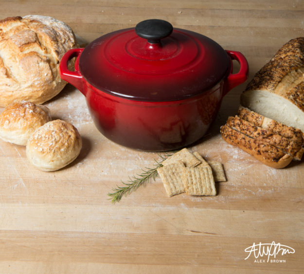
Straight On and Level
This angle creates a lot of shadow and gives the food depth. It also is the best for showcasing supporting items/ingredients in the background. The tabletop/counter isn’t as much as a focal point.

Bird’s Eye View
The reason I call this the bird’s eye view is because it reminds me of Bing Maps Bird’s eye view! This angle is good for showcasing the dimensional aspects of food. Furthermore, it helps viewers establish a spatial awareness of how big items are.

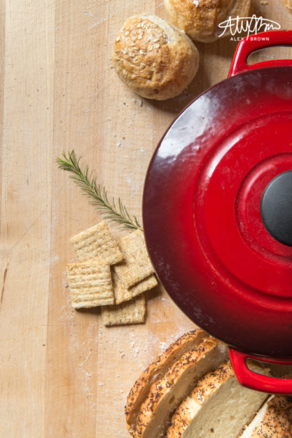
The Overhead
This style of food photography is probably the hero image of any stylized food photography shoot. When doing food photography, overhead shots are great because they allow you to see everything on the table and provide the most negative space if you need to include design elements. Furthermore, the image exudes simplicity and feels uncluttered.

When styling food photography, here are some tips that professional food stylists (yes, it’s a real thing) won’t tell you!
by Alex Brown | Feb 11, 2017
Get three entirely different looks with product photography
Product photography is one of my favorite things to do. I love capturing the different angles of each product. It’s interesting to see how the background of your product can change the entire look and feel of the product itself.
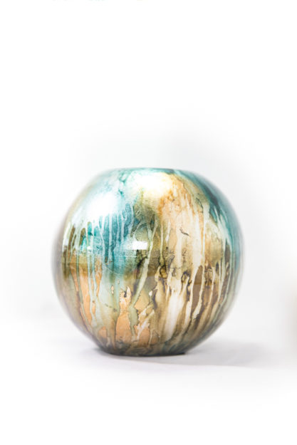
White Background
A white background is sterile and clean. It allows the customer to focus on the product without distractions. Product photography with a white background works best with art products, sculptures and simple products that need. Apple has perhaps made white background product photography the most famous. Check out Apple’s white background product photography setup.

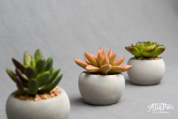
Grey gives it warmth and depth
This is a great example of how a grey background creates depth and warmth to product photography. Combined with the focus on the middle succulent and the light placement to the right depth and warmth is being created.

On Scene
This is a newer trend in product photography and taking this shot was something I enjoyed because it’s different from what I usually do for product photography.

Check out these tips on how to make DIY product photography even better!
by Alex Brown | Feb 11, 2017
I love product photography. It’s amazing what cool angles you are able to get and how interesting your shots can become by changing up lighting. What’s even cooler is when you take your product outdoors!
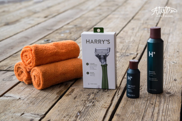
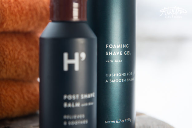
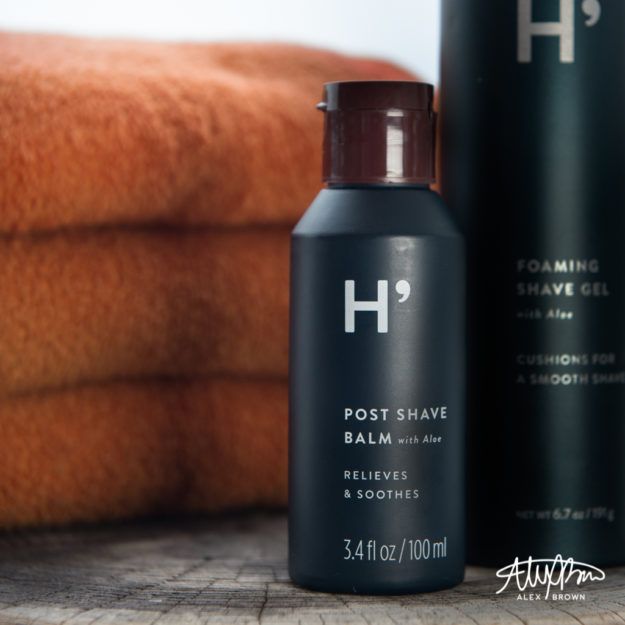
Harry’s is a really company that in the past year or two has taken off, revolutionizing the shaving world. But why should such a revolutionary product be taken on a plain white background? I set off to change that. While on my photo excursion, I took the family of Harry’s products and set them up on the back porch. I loved the way that this wood contrasted against the white box of the razor in addition to the dark teal bottles.

The Family Shot
Following standard design principles help improve photography! I chose to stylize this shoot with orange hand towels, which complement the steel teal of Harry’s brand.

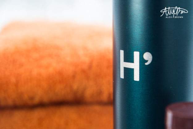
The texture of the deck is beautiful against this modern steel teal colored bottle contrasted with the orange towels.


With this picture, you get a small glimpse of the background – a snow covered land.
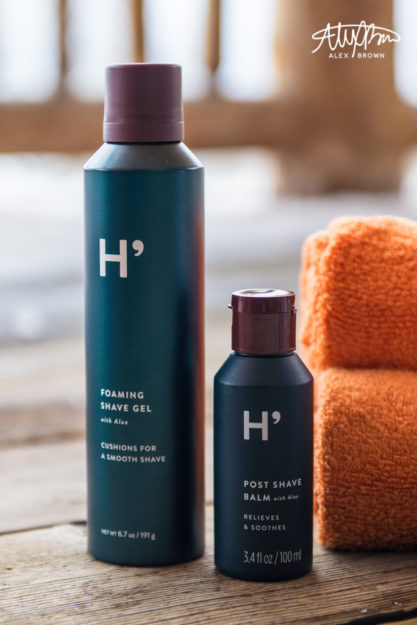
I love using Depth of field in product photography. This is one of my favorite shots because it’s perfect for Harry’s target market which is the social media savvy man (or woman). The depth of field combined with the lighting in this picture allows the customer to be able to read that they also have foaming shave gel.

For more stylized product photography, check out commercial photographer Paulius Musteikis. Also, check out Johngineer’s witty outdoor product photography.
by Alex Brown | Feb 11, 2017
If you can’t tell by now, I’m a person who loves color. So being able to photograph fresh fruit and produce was exciting for me because color is KEY! Like any form of food photography, the main purpose is to make the food your photographing look appealing and appetizing. With fresh fruit and produce photography, you’re on a race against time!
While on my photo excursion/worskhops in Jackson Hole, I discovered three things that are the most important when it comes to fresh fruits and produce photography:
- You’re never close enough… GET CLOSER!
- Texture, Texture, Texture
- Cut, Chop, Dice, Open, Eat!
You’re never close enough
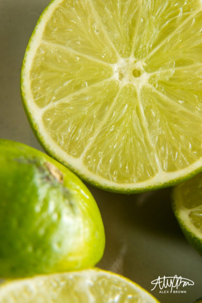
This small dish of limes was sitting by the window off to the side at one of our stations in our workshop. I personally am a fan of this color, so it immediately grabbed my attention. By getting up close and personal, you are able to see details that you might not have otherwise noticed. When you think you’re close enough, get closer! I went a step further and took this picture with macro tubes which showcases the beautiful delicate texture of the limes! You can almost see the squishiness of all that lime juice!

Macro Limes
Texture, Texture, Texture
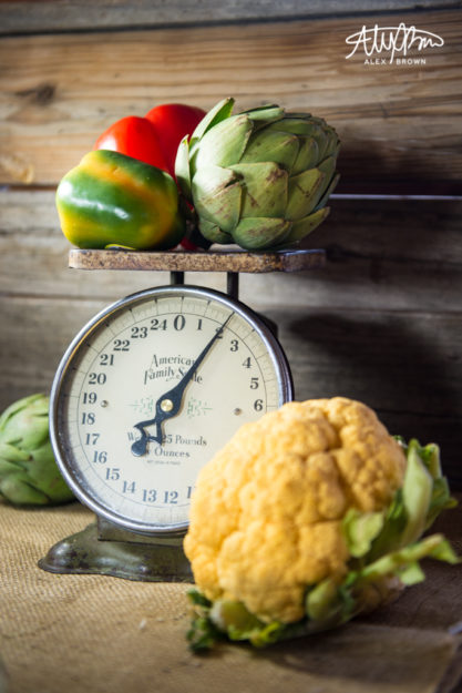
Food is full of textures, so why not repeat and parallel that? I love this shot because of all the texture that is in this photograph. From the burlap cloth on the bottom, to the cauliflower’s bumpy and rough texture, to the artichoke contrasted against the peppers, all these textures come together to create some amazing contrast in this picture, that help accentuate the different details in each fruit and produce item.

Dicing and Slicing with Depth of Field
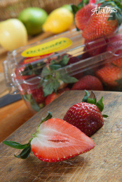
Cut, Slice and Dice your fresh fruit and produce to expose the beautiful inside. These strawberries were sliced in half and it opened up a whole new texture, which looks awesome when contrasted against the outside of the strawberry. This is perhaps my favorite picture because of the depth of field and the atmospheric perspective that it has (we can apply this to food and produce photography, right?). The repetition of colors – red, green, yellow – at each level/depth help create a powerful visual story!

Check out Kelsea Cherie’s website for some other amazing pictures of fresh produce photography!
by Alex Brown | Feb 11, 2017
Do you remember when Instagram first came out? Most likely at any restaurant you could glance over and see someone taking a picture of their food! Food Photographer Brandon Cozza explains why gourmet restaurant food photography is so important to the success of restaurants:
You eat with your eyes first, so making sure that what your eyes see is appealing is key.
In order to tackle the world of gourmet restaurant food photography, I went with a group of photographers to The Lift Jackson Hole. The Lift is an awesome restaurant because it’s got a cool atmosphere, awesome food and is affordable in comparison to other gourmet restaurants in Jackson Hole.
Setting the Scene

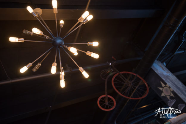
Sometimes you need to look up!

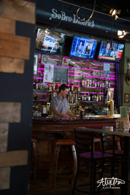
The Lift Jackson Hole is located in the SoBro District, which is south of Broadway on Cache. The bar is rarely empty, unless you come before they actually open.

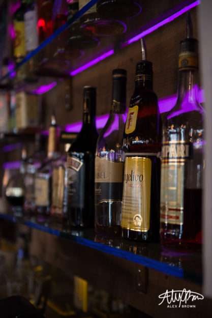
LED lighting changes against the bar wall.
Appetizer Appeal
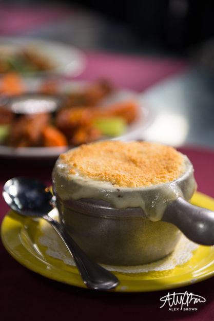
I love controlling the depth of field when shooting gourmet restaurant food. By using big apertures (low f/stop numbers), you are able to focus and showcase certain items/ingredients of the item. In this case, I wanted to show a lineup of appetizers that The Lift Jackson Hole has on its menu; this one picture not only features the Lobster Mac & Cheese, but you can make out the WY Whiskey BBQ Buffalo Wings!

Lobster Mac & Cheese: Melted American Cheese with Red Onion, Lobster, Jalapenos and Cilantro. Topped with Panko.

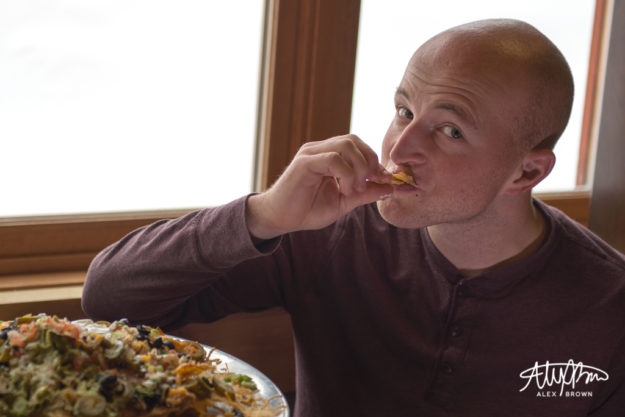
Ben enjoying Angela’s Nachos of Love with Homemade Melted Cheese, Olives, Jalapenos, Black Beans, Pico De Gallo, Guacamole & Sour Cream
The Main Dish

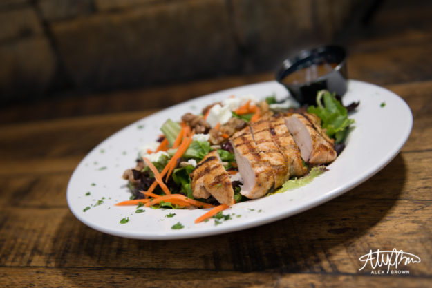
LuLu Salad: Field Greens, Sunflower Seeds, Candied Walnuts, Dried Cranberries, Shredded Carrots, Goat Cheese, with a House Maple Balsamic Vinaigrette

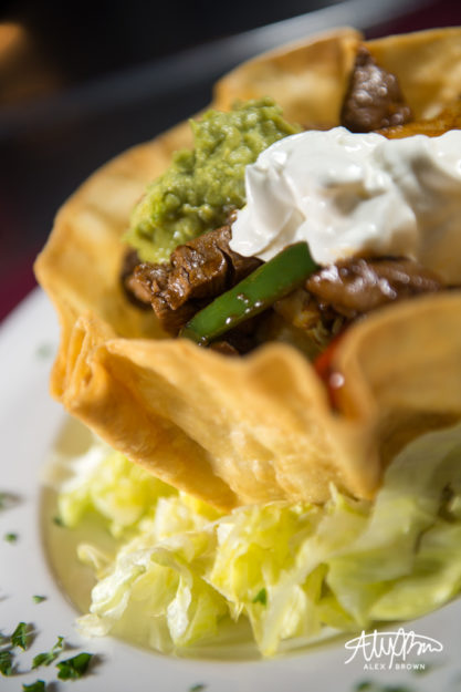
Shorty’s Taco Salad: Fried Tortilla Shell Filled with Mexican Rice, Black Beans, Corn, Lettuce, Shredded Cheese, Pico de Gallo, Guacamole and Sour Cream. *Topped with Fajita Style Peppers, Onions, and Steak.

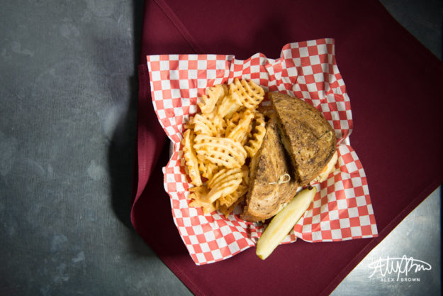
The Rueben

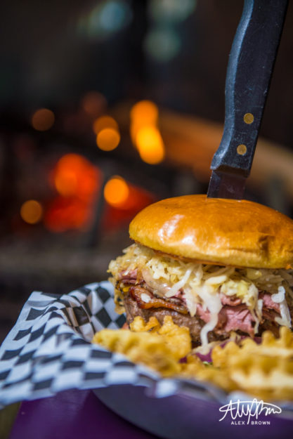
Fat Bastard Burger: Cheddar, Swiss, Pastrami, Sauerkraut, Bacon and Thousand Island
DELICIOUS DESSERTS
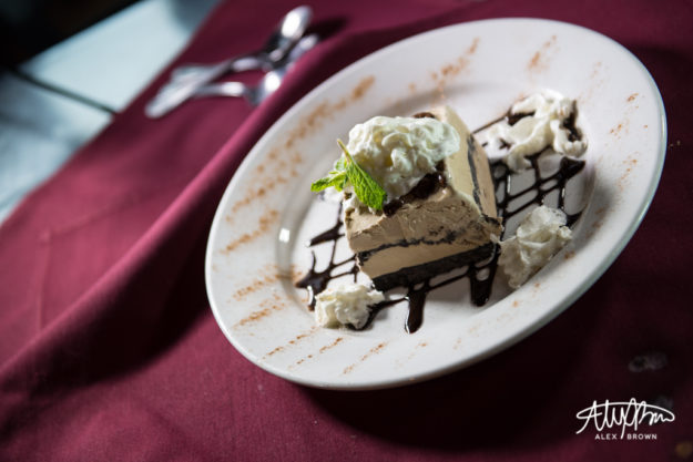
I love how the first picture below has the spoons there in the background. It helps add interest and tells a story.


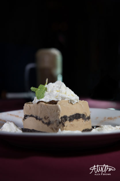
Coffee Ice Cream Oreo Cake with Root Beer Float

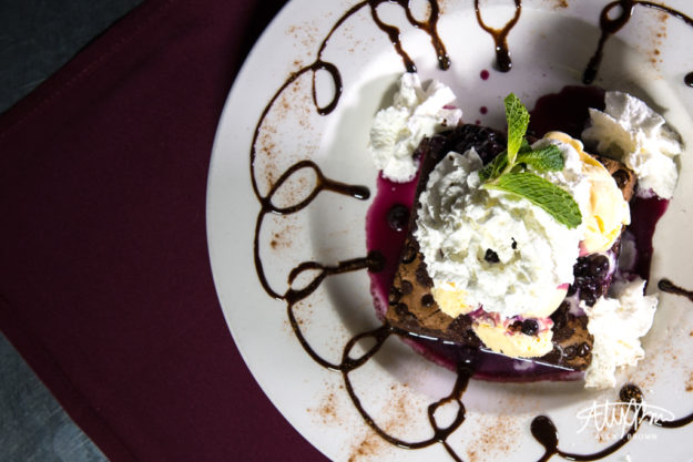
Glory Bowl: Warm Chocolate Chip Brownie with a Huckleberry Compote, Vanilla Ice Cream & Whipped Cream
Here are my top tips if you want to give restaurant food photography a try:
- Check Yelp to find a restaurant nearby that might have awesome food to photograph
- Use a large aperture (small f/stop number)
- Try different angles
- Focus on what makes the dish unique!
- Set the scene by making sure you get pictures of the environment and of people enjoying the food
