by Alex Brown | Mar 22, 2017
Highlighting the two main styles when it comes to men in fashion photography.
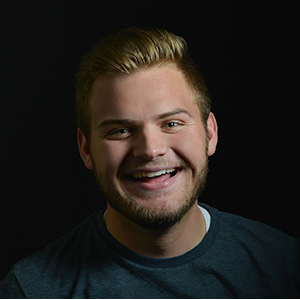
This post is one in a series in what I like to call Fashion Focus. Typically when you think of fashion photography, you might think it’s a woman’s sport. Well, you’d be wrong! Men in fashion photography are just as popular as women are! On a recent fashion shoot workshop, I was able to photograph a variety of models with a variety of styles.
When it comes to men’s fashion photography, I would say there are at least two distinct styles: European and western. When I mean western, I don’t mean saloon shootouts, but more American.

EUROPEAN-INSPIRED MEN’S FASHION PHOTOGRAPHY
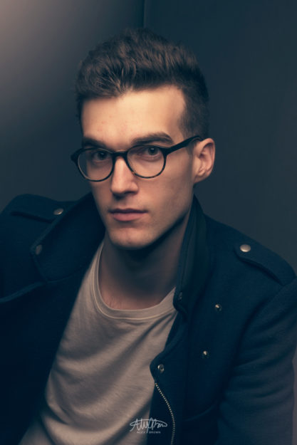
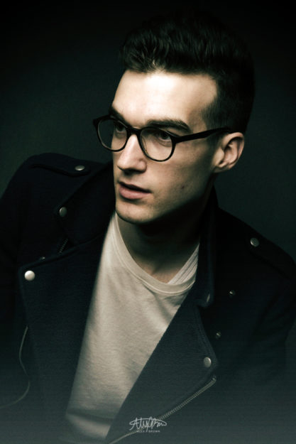
I took these two pictures of my model, Etienne. Although he is from Canada, Etienne’s fashion photography shoot is a perfect example of a more european style. First off, the lighting is a lot more dramatic, the color and toning is more muted and stripped, in addition to the fashion itself being more European in style. Overall, the look and feel is dreamy and creamy.
Brands that come to mind that focus on this style include Calvin Klein, Zara, and H&M.

WESTERN-INSPIRED MEN’S FASHION PHOTOGRAPHY
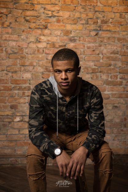
When it comes to western-inspired men’s fashion photography, the look and feel is more lived in, realistic and authentic. Instead of focusing on color toning and dramatic lighting, there is more focus put on the location and the attitude.
Brands that come to mind that focus on this style include American Eagle, Hollister, Abercrombie, and Old Navy.

Since european-inspired men’s fashion photography is more prominent, take a look at this great article by FStoppers where fashion photographer Chris Davis gives tips on how to pose male models.
by Alex Brown | Mar 22, 2017
Discover how small accessories can make a big pop in fashion photography.
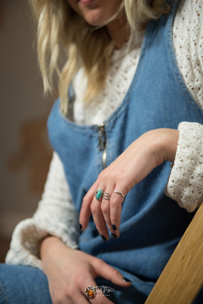
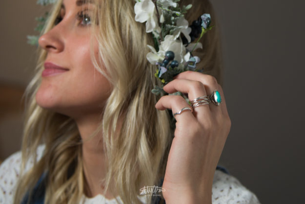
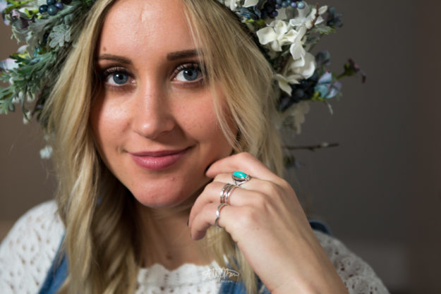
This post is one of a series in what I like to call Fashion Focus. When it comes to the world of fashion photography, small details are just as important as the overall shot. On this recent fashion photoshoot, I was able to get some great images showcasing how you can take small items, such as jewelry, and make them a focal point in your photograph. Here are four tips on how any photographer can take any accessory and sell it with the shutter.
Step 1: Find an accessory.
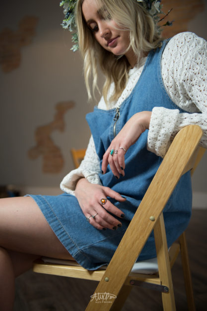
I actually chose to start shooting these rings spontaneously as I was shooting my model Mckenna Wilson. I noticed how she kept looking down at her hands and then I saw the multiple rings on her fingers! In photography, it’s always a good idea to look for design elements, such as complementary colors, which help create drama and mood.

Step 2: Get Closer.
In this case since I was shooting rings, I needed to get closer. When shooting accessories for fashion photography, it’s always a good idea to get a number of shots at various focal lengths.

Step 3: Eyes off-camera.
In order to get this shot, I got candid and relaxed with my model. As she was just doing her thing, I was able to get some great candid shots. Since I want the focus to be her rings – the fashion accessory – I had her look off camera, that way we focus on the rings and not her eyes.

Step 4: Eyes on-camera.
Lastly, make sure that you get a photograph with the model looking at the camera. Not only do you create a connection between the photograph and the viewer, you humanize and provide a connection with emotion. Furthermore, make sure that your fashion accessory is still in focus and is a major focal point.

For more fashion accessories photography, check out Paul Nelson’s website.
by Alex Brown | Mar 18, 2017
Creating an entire magazine ad from start to finish: Creative Direction, Photography, and Design
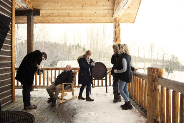
This is my last post about the photography workshop I went on back in February. The whole purpose of this shoot was to conceptualize, direct, photograph, edit and design an advertisement for a company or product using what we had at the cabin.
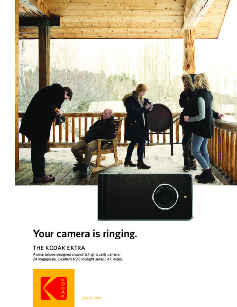
I wanted a product that was both natural and fit well with the environment, but also that would be authentic. We had some various objects to choose from, but in the end, I chose to use these old vintage Kodak cameras. The reason why I chose to use this as my product is because I thought I would be able to incorporate one of Kodak’s newer cameras and have the campaign be, “The Comeback Camera.”
In October 2016, Kodak rebranded incorporating elements of it’s logo from 1971 and 1987. Check out more about this rebrand on one of my favorite blogs, Brand New from Under Consideration.
When I started to work on getting this advertisement ready, I went to Kodak’s website. I explored around a little, especially focusing on the camera section, however I didn’t find any really innovative or compelling cameras that would fit the creative direction of my campaign. However, I did discover the Kodak Ektra.
Now, you might be thinking Kodak is paying me to write all of this, but they aren’t. This post and this work is completely apart of my educational assignment for my COMM316 class. But, I do have to sell the Ektra for a minute here.
First off, the Ektra is a promising smartphone that was designed around it’s camera. As a photographer, I could really care less about megapixels when it comes to a phone camera (it’s important… don’t get me wrong) but the thing that is truly the most amazing about the Ektra is it’s 2.0 ultra low light sensor. While it isn’t as low as the iPhone 7, it’s pretty amazing for a smartphone camera. Plus, even though it’s not as important to me as it might be to others, this camera has 21 megapixels! It’s truly amazing!

With this image, I wanted to showcase the fact that Kodak cameras are still be using today. Furthermore, all the models and photographers are obviously modern day people who would be the perfect target audience for the Ektra. I also like the warmth in the yellow-toning as it helps give the photo an aged look.

I wanted to keep the design simple while also following the look and style of what Kodak is currently doing.
Image Attribution: Camera Image, Kodak Logo
by Alex Brown | Mar 11, 2017
How real estate and interior photography can take basic HDR photography to the next step by adding some extra light.
I have always been a fan of real estate and interior design. When nothing else is on TV, you can always count on the beautiful homes and interiors that grace the screen of HGTV for hours of endless entertainment. I work for a realtor and it’s always so exciting when we get the pictures back from a new real estate listing. I love writing descriptions of homes based upon the interior photography that we get and then to see share those photos with others.
Real estate and interior photography is growing in popularity and demand. Not only do houses sell faster when they have professional photographs, they become even more memorable to buyers when the photographs are beyond impressive!
Capturing HDR images, or high-dynamic range is the common standard and practice for real estate, interior, and architectural photography. An HDR image is actually three separate images – one that is lit perfectly, one that has too much light, and one that is dark – that are then combined. By combing the different exposures, you are able to pull out certain details that a single exposure cannot get alone.
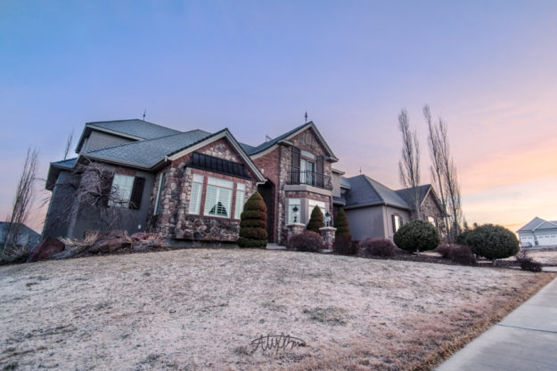
Here’s an example of a beautiful residential home that I took early this morning at sunset. The sky had finally cleared in Rexburg, producing this beautiful sunset. In my opinion, this photograph works well for the house because the sunset is memorable, however, it can still be even better.

An example of real estate photography of an exterior residential home with HDR.
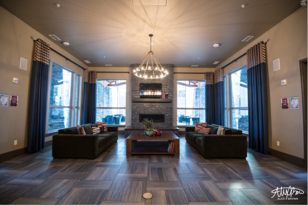
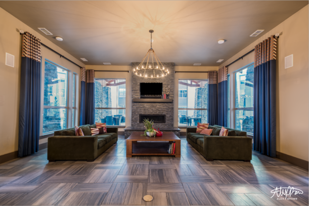
I want to focus more on interior photography for this post, because this interior demonstrates this principle of lighting for interior photography so much better than my early morning attempt does. This is a normal HDR image of a section of the clubhouse at Mountain Lofts here in Rexburg, ID. I love the mix of the rustic feel of a mountain ski lodge combined with the luxury and high end finishes of an urban development.

Mike Kelley is an LA based photographer who set forth to figure out the secrets of architectural, real estate and interior design photographers. Mike Kelley has created beautiful images of buildings, houses, real estate listings and architecture around the world and he does so with one simple tool: a speedlight.
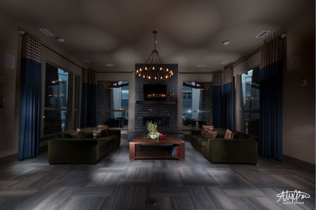
Speed lights are so awesome because they are portable and so powerful! Using a speedlight for real estate and interior photography is a lot like compositing an HDR in Photoshop or Lightroom. After opening up each separate photograph as a layer, you slowly mask them together until you have your interior or exterior photograph lit. Here’s what my speedlight-only image looked like after I finsihed compositing it.

A composite of 65 different layers that have been masked and blended together. Since I shoot in RAW, the file is about 10.65GB big!
I think this interior photograph with just the flash alone is pretty cool, but it doesn’t show off the space and the interior design! This – using a speedlight – is Mike Kelley’s secret when it comes to shooting real estate and interior photography! But wait… there’s more!

After compositing the separate flash images together, bring in the HDR image and you get an amazingly beautiful result like this! By compositing an HDR image and a flash composite, real estate and interior photography comes to life because of the depth that is created from the shadows by the speedlight.
Check out more amazing real estate and interior photographs by Mike Kelley on his website.
by Alex Brown | Mar 11, 2017
Whether you Airbnb, VBRO, or Homeaway, professional photographs can transform your property’s listing and increase occupancy.
Whenever I travel, I typically stay in hotels. Recently, I discovered the new craze when it comes to vacation rentals through sites like Airbnb and VBRO. I love real estate, interior design and architectural photography. Recently I discovered that this field isn’t really saturated with photographers so I decided to get some practice and build my portfolio in this area.
I started searching out through the various apps. In one case, one homeowner saw an increase of 39% in rentals after he had professional photographs taken. With this apart of my pitch, I reached out to a number of hosts on Airbnb and was able to get a few vacation rental photography shoots lined up.
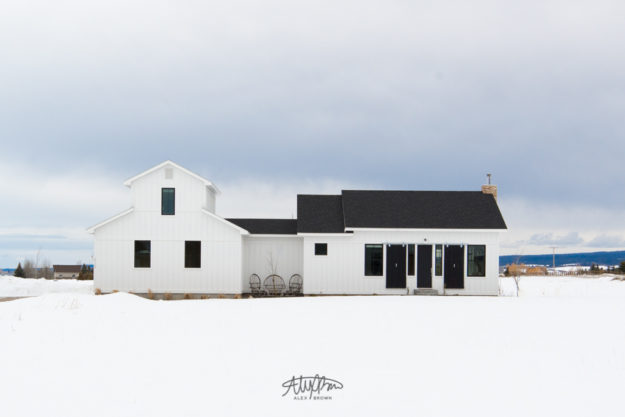
Jacie and Justin were warm enough to let me into their beautiful vacation rental in Driggs, ID. Jacie designed and decorated the home. I fell in love with this home because of all the natural light that flooded the open concept floor plan. Here are some pictures of the outside of their property.
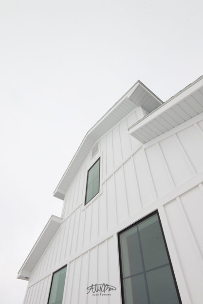
When taking exterior pictures for vacation rentals or real estate listing photography you need to make sure you keep them plain and simple, highlight the curb appeal and make sure all the lines are straight. It’s a bit hard to do the second one when you’re in the middle of winter.


Exterior Detail
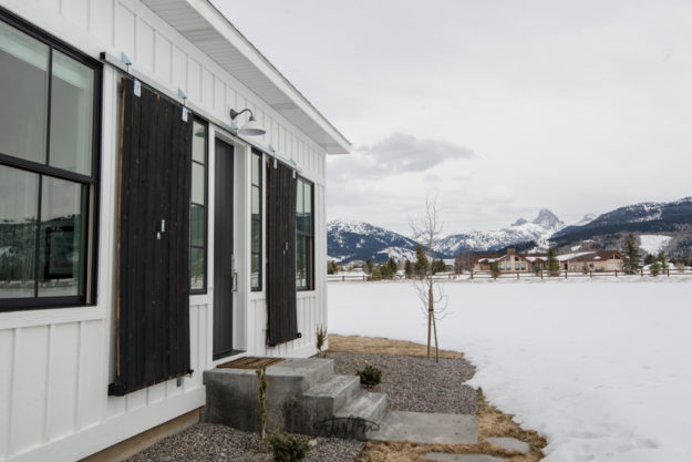
It’s important to note that these photographs are going to sell this listing to potential vacation renters or even those who are going to buy the home. I wanted to get a shot of the house with its most prominent selling feature… the view of the Tetons!

View of the Tetons from the front door
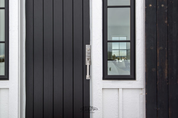
Also, don’t forget to detail shots. I love the repetition of the vertical lines that this house has. Combined with the muted blacks, I wanted to showcase the contrast of the modern nickel handlebar.

Beautiful Front Door
To read more about vacation rental photography check out this article.
by Alex Brown | Mar 11, 2017
Whether you Airbnb, VBRO, or Homeaway, professional photographs can transform your property’s listing and increase occupancy.
Whenever I travel, I typically stay in hotels. Recently, I discovered the new craze when it comes to vacation rentals through sites like Airbnb and VBRO. I love real estate, interior design and architectural photography. Recently I discovered that this field isn’t really saturated with photographers so I decided to get some practice and build my portfolio in this area.
I started searching out through the various apps. In one case, one homeowner saw an increase of 39% in rentals after he had professional photographs taken. With this apart of my pitch, I reached out to a number of hosts on Airbnb and was able to get a few vacation rental photography shoots lined up.
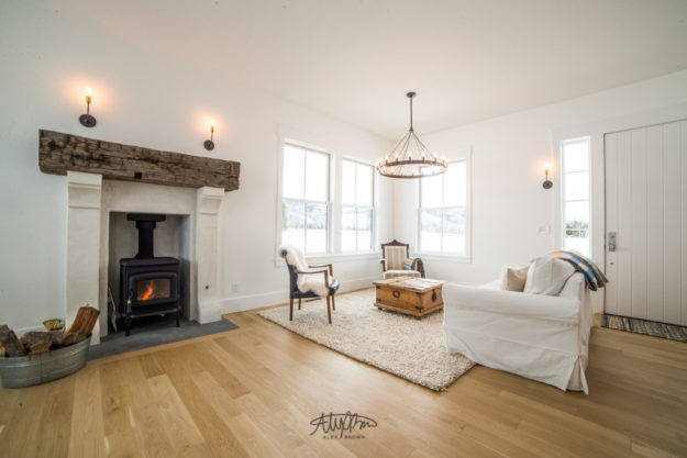
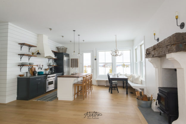
Jacie and Justin were warm enough to let me into their beautiful vacation rental in Driggs, ID. Jacie designed and decorated the home. I fell in love with this home because of all the natural light that flooded the open concept floor plan. Here are some pictures of the outside of their property.

Living Room with Wood Burning Fireplace

Kitchen with Gourmet Appliances

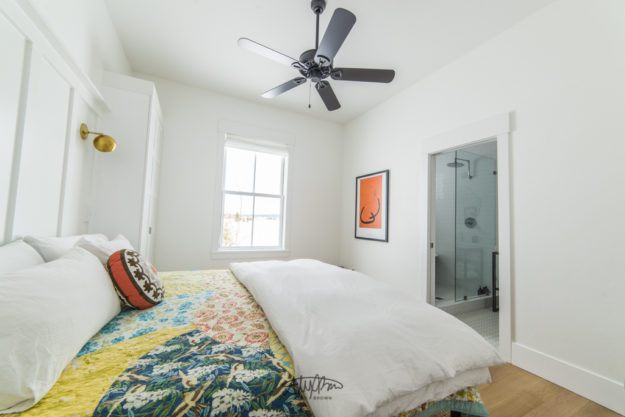
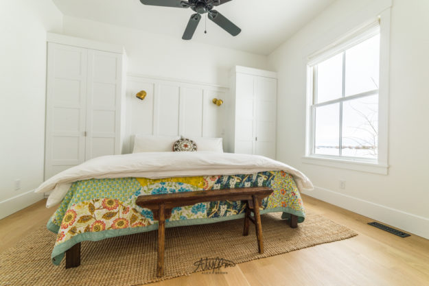
Master Bedroom

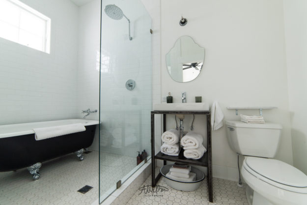
On Suite Master Bathroom

Master Bedroom

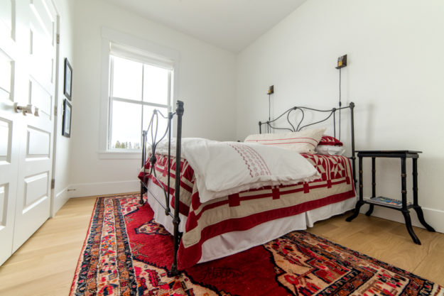
Guest Bedroom

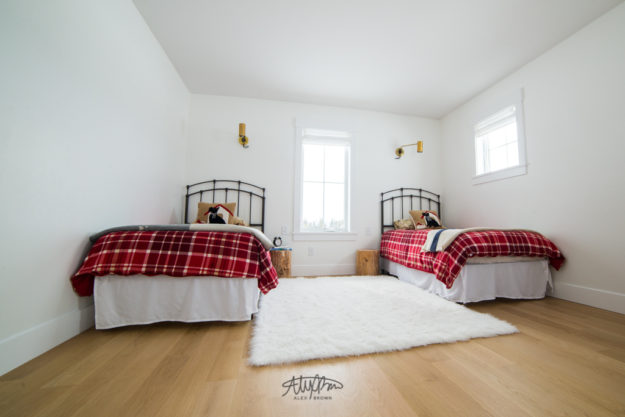
Kid’s Bedroom Over Garage

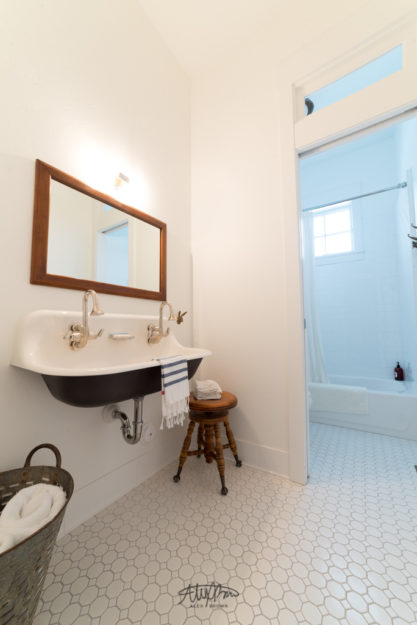
Second Bathroom


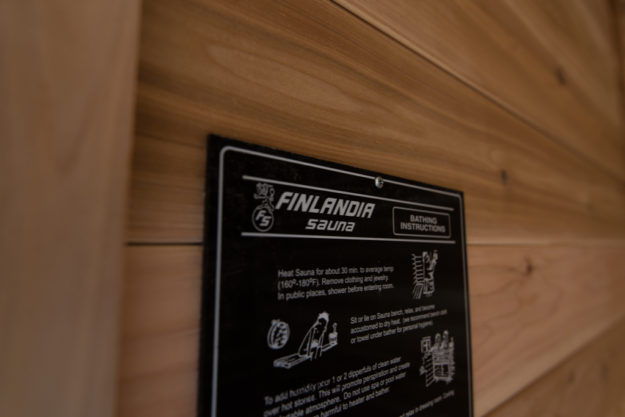
Sauna

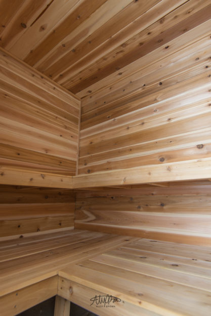
Sauna
To read more about vacation rental photography check out this article.
