by Alex Brown | Feb 11, 2017
If you can’t tell by now, I’m a person who loves color. So being able to photograph fresh fruit and produce was exciting for me because color is KEY! Like any form of food photography, the main purpose is to make the food your photographing look appealing and appetizing. With fresh fruit and produce photography, you’re on a race against time!
While on my photo excursion/worskhops in Jackson Hole, I discovered three things that are the most important when it comes to fresh fruits and produce photography:
- You’re never close enough… GET CLOSER!
- Texture, Texture, Texture
- Cut, Chop, Dice, Open, Eat!
You’re never close enough
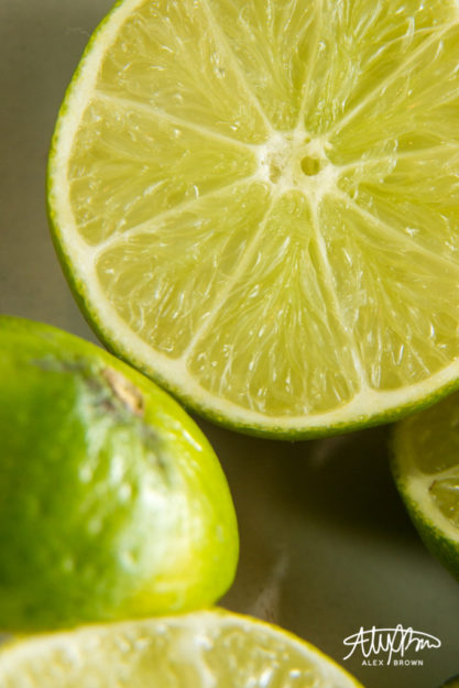
This small dish of limes was sitting by the window off to the side at one of our stations in our workshop. I personally am a fan of this color, so it immediately grabbed my attention. By getting up close and personal, you are able to see details that you might not have otherwise noticed. When you think you’re close enough, get closer! I went a step further and took this picture with macro tubes which showcases the beautiful delicate texture of the limes! You can almost see the squishiness of all that lime juice!

Macro Limes
Texture, Texture, Texture
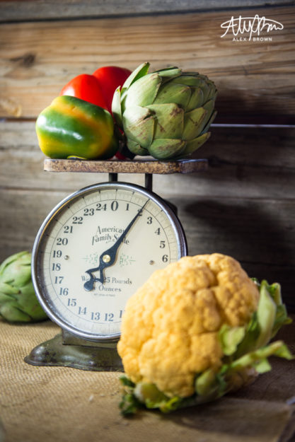
Food is full of textures, so why not repeat and parallel that? I love this shot because of all the texture that is in this photograph. From the burlap cloth on the bottom, to the cauliflower’s bumpy and rough texture, to the artichoke contrasted against the peppers, all these textures come together to create some amazing contrast in this picture, that help accentuate the different details in each fruit and produce item.

Dicing and Slicing with Depth of Field
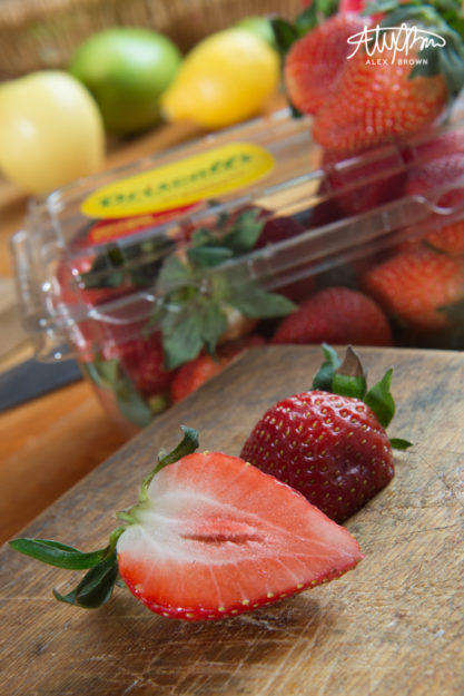
Cut, Slice and Dice your fresh fruit and produce to expose the beautiful inside. These strawberries were sliced in half and it opened up a whole new texture, which looks awesome when contrasted against the outside of the strawberry. This is perhaps my favorite picture because of the depth of field and the atmospheric perspective that it has (we can apply this to food and produce photography, right?). The repetition of colors – red, green, yellow – at each level/depth help create a powerful visual story!

Check out Kelsea Cherie’s website for some other amazing pictures of fresh produce photography!
by Alex Brown | Feb 11, 2017
Do you remember when Instagram first came out? Most likely at any restaurant you could glance over and see someone taking a picture of their food! Food Photographer Brandon Cozza explains why gourmet restaurant food photography is so important to the success of restaurants:
You eat with your eyes first, so making sure that what your eyes see is appealing is key.
In order to tackle the world of gourmet restaurant food photography, I went with a group of photographers to The Lift Jackson Hole. The Lift is an awesome restaurant because it’s got a cool atmosphere, awesome food and is affordable in comparison to other gourmet restaurants in Jackson Hole.
Setting the Scene

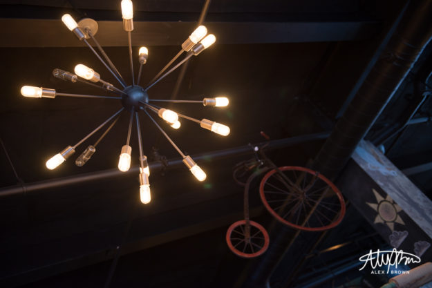
Sometimes you need to look up!

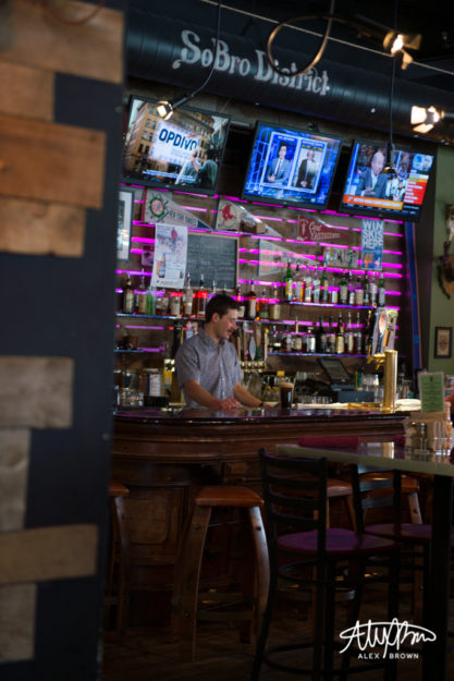
The Lift Jackson Hole is located in the SoBro District, which is south of Broadway on Cache. The bar is rarely empty, unless you come before they actually open.

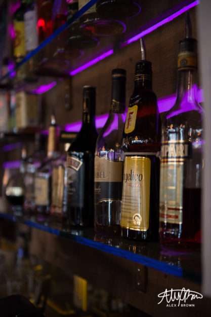
LED lighting changes against the bar wall.
Appetizer Appeal
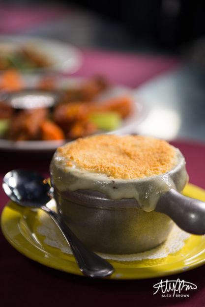
I love controlling the depth of field when shooting gourmet restaurant food. By using big apertures (low f/stop numbers), you are able to focus and showcase certain items/ingredients of the item. In this case, I wanted to show a lineup of appetizers that The Lift Jackson Hole has on its menu; this one picture not only features the Lobster Mac & Cheese, but you can make out the WY Whiskey BBQ Buffalo Wings!

Lobster Mac & Cheese: Melted American Cheese with Red Onion, Lobster, Jalapenos and Cilantro. Topped with Panko.

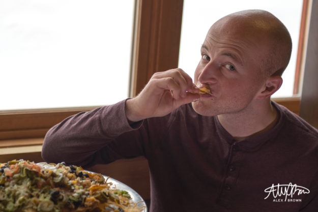
Ben enjoying Angela’s Nachos of Love with Homemade Melted Cheese, Olives, Jalapenos, Black Beans, Pico De Gallo, Guacamole & Sour Cream
The Main Dish

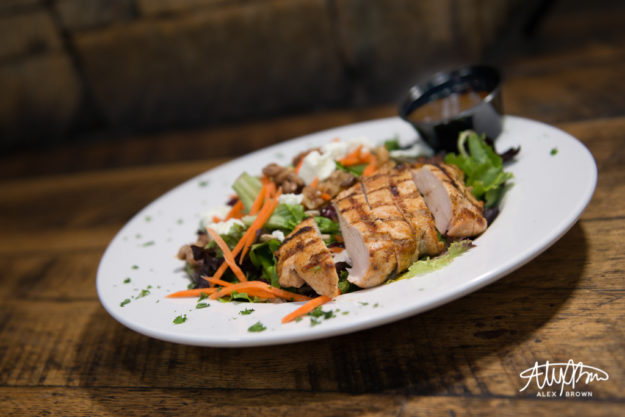
LuLu Salad: Field Greens, Sunflower Seeds, Candied Walnuts, Dried Cranberries, Shredded Carrots, Goat Cheese, with a House Maple Balsamic Vinaigrette

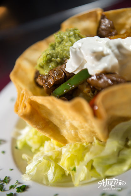
Shorty’s Taco Salad: Fried Tortilla Shell Filled with Mexican Rice, Black Beans, Corn, Lettuce, Shredded Cheese, Pico de Gallo, Guacamole and Sour Cream. *Topped with Fajita Style Peppers, Onions, and Steak.

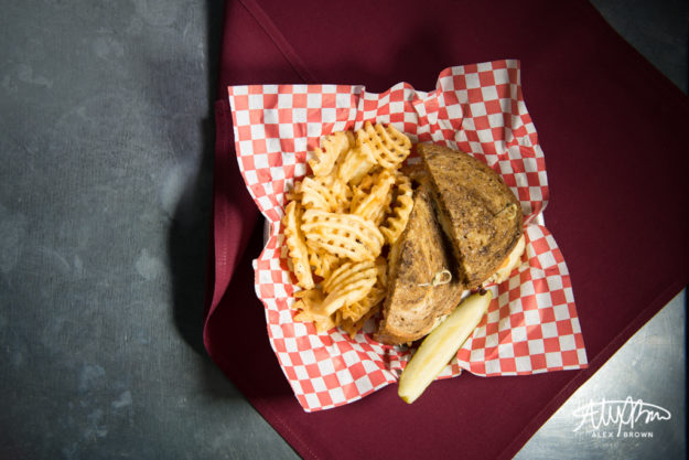
The Rueben

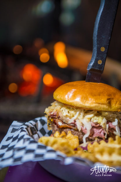
Fat Bastard Burger: Cheddar, Swiss, Pastrami, Sauerkraut, Bacon and Thousand Island
DELICIOUS DESSERTS
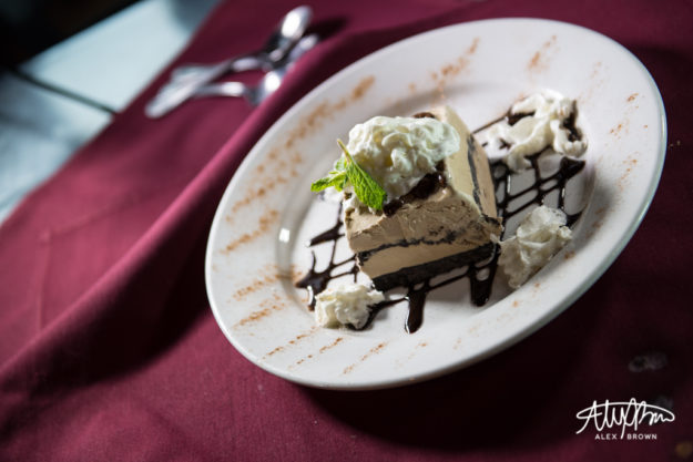
I love how the first picture below has the spoons there in the background. It helps add interest and tells a story.


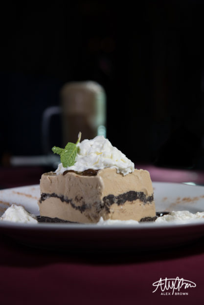
Coffee Ice Cream Oreo Cake with Root Beer Float

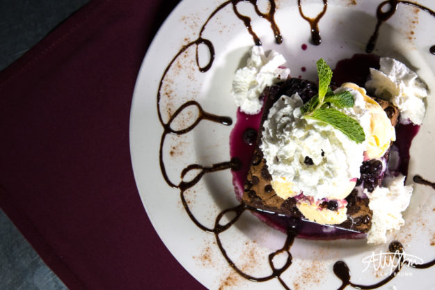
Glory Bowl: Warm Chocolate Chip Brownie with a Huckleberry Compote, Vanilla Ice Cream & Whipped Cream
Here are my top tips if you want to give restaurant food photography a try:
- Check Yelp to find a restaurant nearby that might have awesome food to photograph
- Use a large aperture (small f/stop number)
- Try different angles
- Focus on what makes the dish unique!
- Set the scene by making sure you get pictures of the environment and of people enjoying the food
by Alex Brown | Feb 11, 2017

Photoshop is awesome when you have a great tagline for an advertisement in mind but no means to make a photoshoot happen!
I created this photoshop composite advertising the Ford Expedition. I drove one for a day on a recent photo excursion in Grand Teton National Park. I’m a car guy so I was surprised on how well it drove!
When we stopped to use the restroom, I was just walking around and admiring the car! I decided to take out my camera and tripod and get an awesome shot of this expedition! It was in a natural environment and I thought it looked great.
I knew I wanted to create an ad for the Expedition when I had the challenge to create a photoshop composite, so I decided to theme it around the winter months. I love remote mountain scenes, and when you put a skier or snowboarder in it, it makes it even more amazing! I had the story!
After finding the images I wanted, I brought them all together in photoshop where I blended the Expedition into this mountain scene and adjusted the coloring. To add that final touch, I put the snowboarder on the mountain and used the spot healing brush to clear the rocks out of his path (this is realistic, right?).
With the photo done, I then brought it into Illustrator where I added the text following Ford’s current advertising creative direction and dropped in that witty tagline that completes the story told by this composite!


by Alex Brown | Feb 10, 2017
How an ordinary day with an ordinary item turned into amazing abstract artwork.
Scanography: The process of capturing digitized images of objects for the purpose of creating printable art using a flatbed “photo” scanner with a CCD (charge-coupled device) array capturing device.
Prior to this activity, I’ve never used a scanner to create artwork. I have never even thought about using it as a method to create art. However, it’s amazing what results you can get with a scanner!
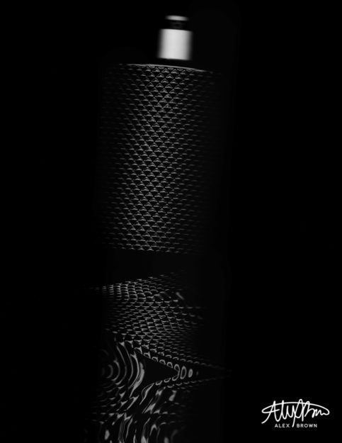
When I was thinking about what I could create with my scanner, I knew I wanted it to be abstract enough to become fine art. I have an HP Officejet 7500A, which sits on the ground in my room underneath my shelves since it’s so dang big (it can print up to 13×19). Right above the printer, I have all my cologne out on a shelf. I looked up and saw my bottle of James Bond 007 Black cologne and knew that it would be awesome with a scanner. I’ve taken some cool pictures of this bottle before, but I wanted to see how the light of the scanner would affect the texture/pattern on the bottle when it was moving.
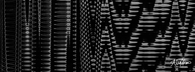
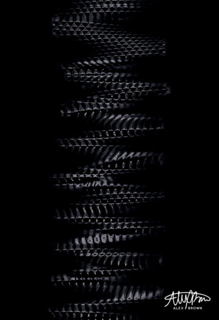
From the thirty different scans I actually committed to (I used the overview function a lot), I liked these four the best.

Graduated Texture
I love this first scan because of the graduated texture. Even though the texture of the bottle is all the same, by adjusting the speed and movement at which I moved the bottle on the bed created these variations in texture.

Snake Skin

Product Scanography
Who ever knew that you could pull of product photography with a scanner?

Science Tubes
When you play around with the scanner settings, specifically color settings it’s interesting to see what you end up with!
by Alex Brown | Jan 28, 2017
When the avgeek, photographer, and designer in me come together to recreate the movie poster for “Sully”.
Design and photography are essential to movie posters. Both of these being my passions, I needed to think of something else in my life that I absolutely love. And then the ah-ha moment came… AVIATION! Yes, it’s a little weird, not gonna lie. I’m that one crazy person who will connect in Atlanta in order to fly on an international aircraft instead of flying nonstop. Now, it was trying to find the right movie to depict.
Recently, Sully, the movie came out. I still haven’t seen it, but I remember that night exactly. It was a January night when a flock of geese took out both engines of US Airways flight 1549. After 208 seconds after taking off from New York’s LaGuardia airport, Captain Sully Sullenberger made the decision to ditch his Airbus A320 aircraft, along with 155 people on board, into the freezing waters of the Hudson. I remember this night very well. We were on our way home after going to Costco. We had just gotten back on Independence Blvd. in Charlotte and my dad turned up the radio. I wasn’t exactly sure what happened, so the minute I got home, I turned on the TV and watched the coverage from there.

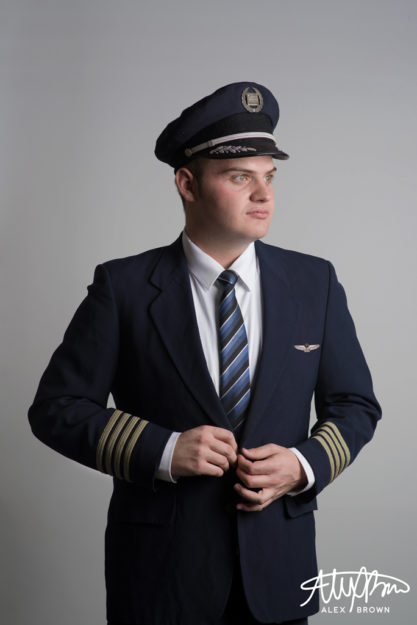
Being an Avgeek, making an aviation movie poster meant that it not only had to be realistic but most importantly it had to be accurate. Everything except for the tie and white shirt is apart of a real US Airways uniform that I acquired a few years back from a pilot friend. The uniform wasn’t the same one worn by crews at the time of the crash, however, it still is real!


Editing the Movie Poster
When it came to editing my poster, I wanted to keep it as realistic to the actual Sully movie poster itself as well as to the
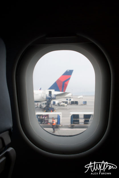
I decided to use my own picture of an airplane window I took a few years ago instead of using one from the internet. With the water and clouds, I used images from the Sully Movie website and reconstructed the layers in Photoshop. After doing some simple retouching, I removed the background on my self-portrait and placed it in my poster.
The wings were too difficult to get a hold of, so I was able to find a high-quality picture of them from StanWings.com, an aviation wings website, and photoshopped them on the jacket. The hardest thing about this part was the fact that the new uniforms from US Airways all had silver badges and accents, instead of the gold that are on mine, so I also spent a lot of time photoshopping the wings to make them match the hat.
After finishing my photo, I then went into Illustrator, where I put together the text of the poster. I chose to rename the movie “Brace for Impact” because first off I’m not Sully, but second off it was the words heard from the cockpit before the plane went down.
Here are the direct links to images used from the internet: http://www.sully-movie.com/img/plax-bkg/desk-land_plax_0.png, http://www.sully-movie.com/img/plax-bkg/desk-land_plax_3.png, http://www.sully-movie.com/img/plax-bkg/desk-land_plax_1.png, http://www.sully-movie.com/img/plax-bkg/desk-land_plax_clouds.jpg, http://www.stanwing.com/wings/u/usair/USAir_28-Supervisory%20Captain%20Wing%208th%20Issue.jpg
by Alex Brown | Jan 21, 2017
Instead of thinking about life through a lens, start living it; Capturing amazing moments of real life with street photography and still life photography.
Think of your daily route to work or school. You do it so often it becomes boring and ordinary. I know there have been times when I’ve noticed something and I’ve contemplated whether or not it’s new or if something has changed. Most likely, it probably it hasn’t.
I was challenged to merge my ordinary real life with my creative mind in something called OS-ES. After attending a conference and workshop, photographer and visual communications professor Caryn Esplin was amazed by the work of Roberto Valenzuela – specifically how he was able to take an ordinary spot and turn it into an extraordinary shot (OS-ES).
Street Photography
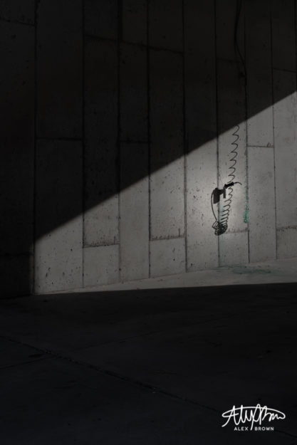
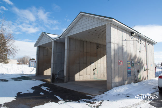
Living in Idaho, urban and street photography is something that is somewhat hard to come by. As I was driving around Eastern Idaho, I came by this ordinary spot and was fascinated by how the light created abstract shadows against these concrete walls. You’re going to have to wait to see the ordinary spot, but here’s the extraordinary shot I got:

Extraordinary Shot
What I love most about this image is how thoughtful and contemplative it is. It’s conceptual in nature. I took this shot with the intent of making the viewer try to think about exactly what it is. Not only did this remind me of my Eucalyptus Euphoria project, it reminded me of what the great street photographer, Eric Kim, mentions in his guide to street photography:
Not all street photography needs to be super emotional. Some street photographs are purely visual images– that appeal to our sense of geometry, composition, and composition. These images are generally shot in good light with nice lights and shadows, have strong diagonal lines, leading lines, curves, and shapes of interest
Still Life Photography
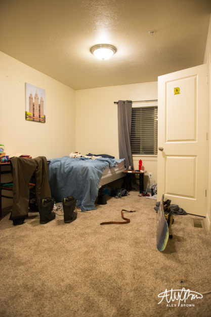
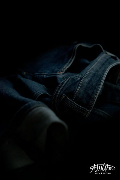
Still life photography is a lot like street photography, except you capture the emotion and pause the life of inanimate objects. I thought a lot about how I could get an extraordinary shot out of an ordinary spot. I think because of this, I tended to overthink it. After changing out my camera battery, I was just browsing in my room and I noticed not only how the light from the window was hitting my roommate’s bed, but also how he “set” his covers up before he went boarding this morning.

Ordinary Spot

Extraordinary Shot
With photography, my favorite angle is the lowest angle possible. So, when I got lower and closer to his bed, I noticed his pair of jeans on the floor. And then the creativity happened with this shot. Who knew an ordinary pair of jeans could turn in to such a dramatic still life photograph?! (I guess he now has an excuse for not picking his clothes up off the floor.)
Oh… before I forget. Here’s the ordinary spot of the first picture. Also, check out Megan Graham’s challenge with OS-ES.

Ordinary Spot
