by Alex Brown | Mar 22, 2017
Discover how small accessories can make a big pop in fashion photography.
This post is one of a series in what I like to call Fashion Focus. When it comes to the world of fashion photography, small details are just as important as the overall shot. On this recent fashion photoshoot, I was able to get some great images showcasing how you can take small items, such as jewelry, and make them a focal point in your photograph. Here are four tips on how any photographer can take any accessory and sell it with the shutter.
Step 1: Find an accessory.
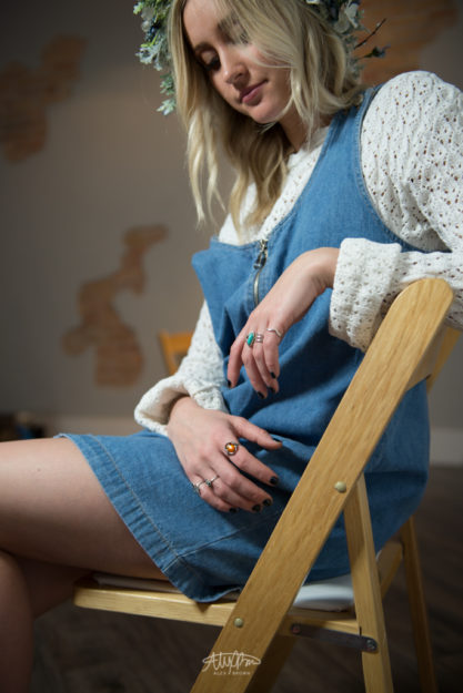
I actually chose to start shooting these rings spontaneously as I was shooting my model Mckenna Wilson. I noticed how she kept looking down at her hands and then I saw the multiple rings on her fingers! In photography, it’s always a good idea to look for design elements, such as complementary colors, which help create drama and mood.
Step 2: Get Closer.
In this case since I was shooting rings, I needed to get closer. When shooting accessories for fashion photography, it’s always a good idea to get a number of shots at various focal lengths.
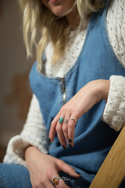
Step 3: Eyes off-camera.
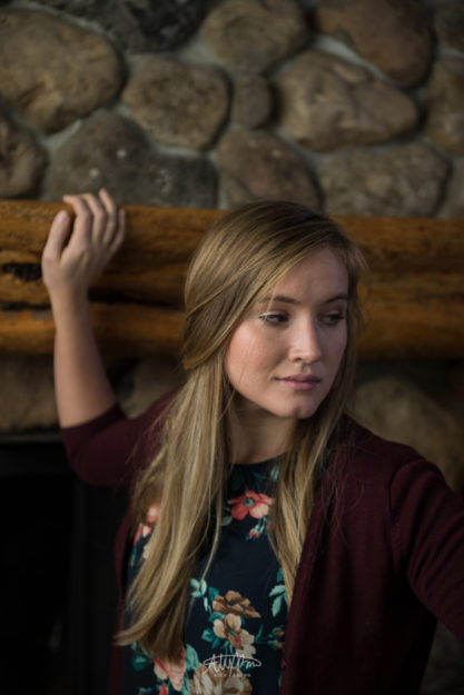
In order to get this shot, I got candid and relaxed with my model. As she was just doing her thing, I was able to get some great candid shots. Since I want the focus to be her rings – the fashion accessory – I had her look off camera, that way we focus on the rings and not her eyes.
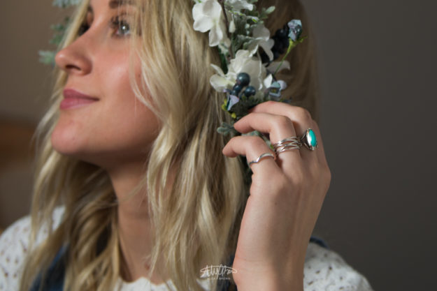
Step 4: Eyes on-camera.
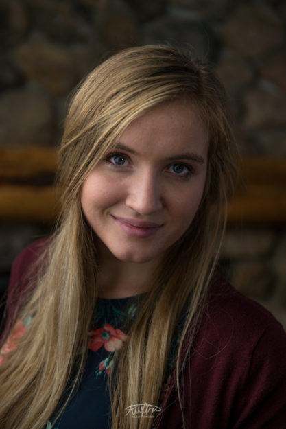
Lastly, make sure that you get a photograph with the model looking at the camera. Not only do you create a connection between the photograph and the viewer, you humanize and provide a connection with emotion. Furthermore, make sure that your fashion accessory is still in focus and is a major focal point.
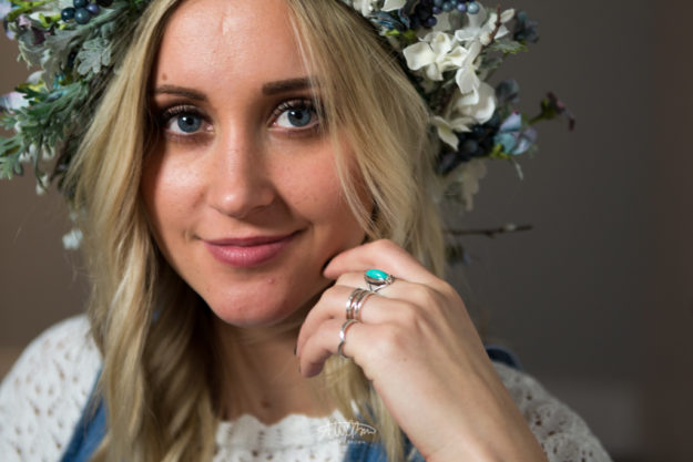
For more fashion accessories photography, check out Paul Nelson’s website.
by Alex Brown | Mar 18, 2017
Creating an entire magazine ad from start to finish: Creative Direction, Photography, and Design
This is my last post about the photography workshop I went on back in February. The whole purpose of this shoot was to conceptualize, direct, photograph, edit and design an advertisement for a company or product using what we had at the cabin.
I wanted a product that was both natural and fit well with the environment, but also that would be authentic. We had some various objects to choose from, but in the end, I chose to use these old vintage Kodak cameras. The reason why I chose to use this as my product is because I thought I would be able to incorporate one of Kodak’s newer cameras and have the campaign be, “The Comeback Camera.”
In October 2016, Kodak rebranded incorporating elements of it’s logo from 1971 and 1987. Check out more about this rebrand on one of my favorite blogs, Brand New from Under Consideration.
When I started to work on getting this advertisement ready, I went to Kodak’s website. I explored around a little, especially focusing on the camera section, however I didn’t find any really innovative or compelling cameras that would fit the creative direction of my campaign. However, I did discover the Kodak Ektra.
Now, you might be thinking Kodak is paying me to write all of this, but they aren’t. This post and this work is completely apart of my educational assignment for my COMM316 class. But, I do have to sell the Ektra for a minute here.
First off, the Ektra is a promising smartphone that was designed around it’s camera. As a photographer, I could really care less about megapixels when it comes to a phone camera (it’s important… don’t get me wrong) but the thing that is truly the most amazing about the Ektra is it’s 2.0 ultra low light sensor. While it isn’t as low as the iPhone 7, it’s pretty amazing for a smartphone camera. Plus, even though it’s not as important to me as it might be to others, this camera has 21 megapixels! It’s truly amazing!
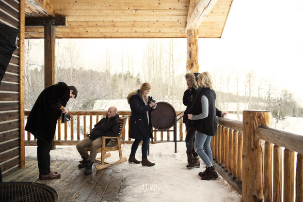
With this image, I wanted to showcase the fact that Kodak cameras are still be using today. Furthermore, all the models and photographers are obviously modern day people who would be the perfect target audience for the Ektra. I also like the warmth in the yellow-toning as it helps give the photo an aged look.
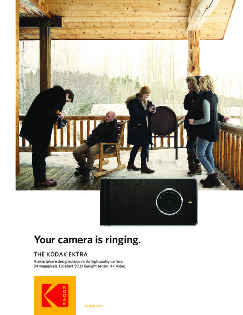
I wanted to keep the design simple while also following the look and style of what Kodak is currently doing.
Image Attribution: Camera Image, Kodak Logo
by Alex Brown | Mar 15, 2017
COMM316 Idaho Portrait Photoshoot Workshop – Stock Photography Candidates
Back in January I went with a group of other students taking COMM316 at BYU-Idaho to Sky Mountain Lodge located in Victor, ID for a 4-day photo workshop.
On the third day of our excursion we spent a lot of time working on portraits. Being a photographer in Idaho is somewhat difficult due to the amount of competition we have here, so it’s important to learn various and different lighting techniques that allow us to differentiate ourselves from the competition and give us a competitive edge. All of these pictures were taken using the awesome and portable Rogue Flashbenders. These light modifiers are great for speedlights since they are ultra portable and super lightweight.
These photos take the normal portrait and put a complete different twist on them. All of these Idaho portraits would be excellent photos for stock photography! Stock photography is more than photos that just have a white background; they’re photos that are conceptual and tell a story behind them. As you look at these, try to imagine what was actually going on in these photos.


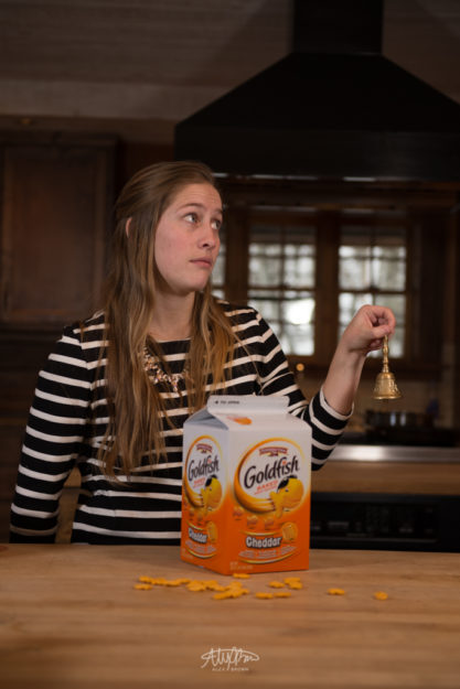
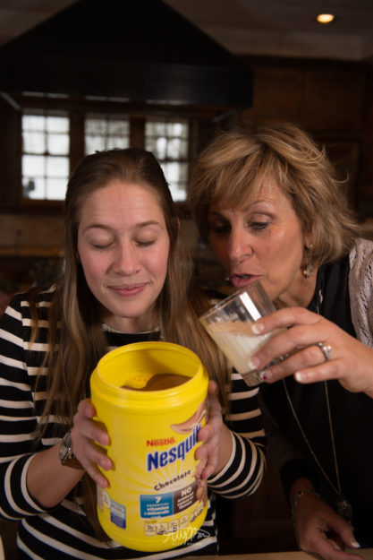
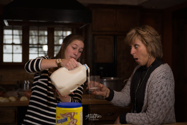
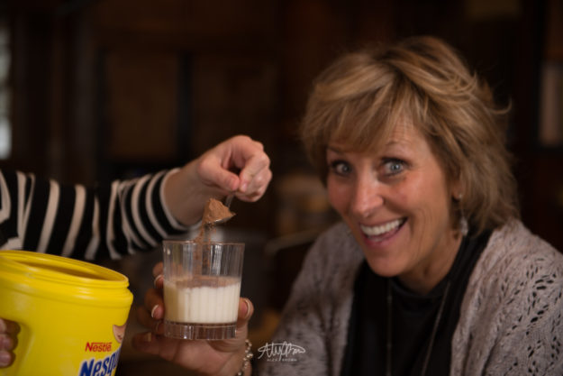
Take a look at some more funny stock photos here.
by Alex Brown | Mar 15, 2017
Some of my favorites from our COMM316 Idaho Portrait Photoshoot Workshop
Back in January I went with a group of other students taking COMM316 at BYU-Idaho to Sky Mountain Lodge located in Victor, ID for a 4-day photo workshop.
On the third day of our excursion we spent a lot of time working on portraits. Being a photographer in Idaho is somewhat difficult due to the amount of competition we have here, so it’s important to learn various and different lighting techniques that allow us to differentiate ourselves from the competition and give us a competitive edge. All of these pictures were taken using various forms of auxiliary lighting – whether it be the Einstein strobes, continuous lights modified with soft boxes or the wonderful speedlights with octobox modifiers.
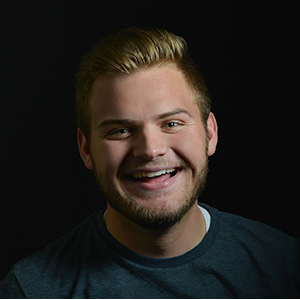
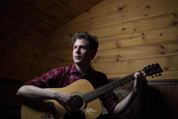 Helaman in this picture looks like John Mayer. While I can’t remember if he actually played the guitar, I do remember this lighting was AWESOME. This is a great example of the Rembrandt lighting pattern. I love his pose, the direction of the light and the overall environment. This Idaho portrait would be the perfect cover for a country album!

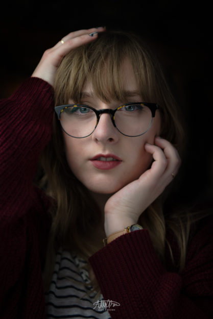
I will say that this pose might seem totally unnatural, but it totally wasn’t! When I got to shoot Emily Birkmeyer’s Idaho portrait, she was doing something with her hands on her head and I absolutely love it. I think the reason why the pose works so well for this picture is the fact that it helps frame her face. In addition I love how only the brightest of colors are located between her hands — her lipstick, eyes, and the yellow in her glasses!


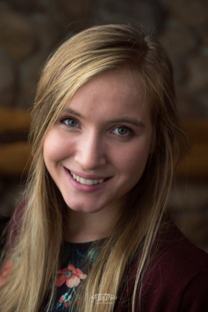
Meet Emily Froelich! She’s an awesome designer and a great photographer! I love all three of these Idaho portraits that I captured of her because her look is timeless and the background is different yet works! When editing Emily’s portraits I focused on evening out the lighting on her skin and sharpening her eyes!
Check out more awesome Idaho portraits by Janae Harker.
by Alex Brown | Mar 15, 2017
No matter what color backdrop you have, find out three simple ways that can make any studio photoshoot fun.

CAROUSEL
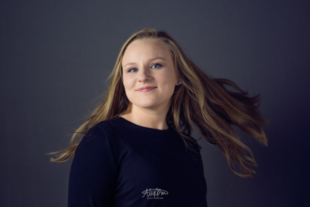
As a photographer, freezing motion is one of the easiest and simplest things you can have any model or subject do! First off, Baylie Madyson is a great photographer herself, but she is so photogenic. When freezing motion with a model, it’s important to direct your model to keep a great expression and face throughout the shot. If you think about it, when the model is moving around they are more focused about completing the action or making sure not to knock over anything – instead of their expression. When it came to this shoot, we used a Wescott Spiderlight with a huge 80″ octabox and a diffusor panel and then had a grey backdrop I love shooting on grey backdrops because the complement any work well for any skin tone, most clothing and provide a nice radial gradient behind the model. Plus, it’s awesome to go in Photoshop and adjust the color of blacks!

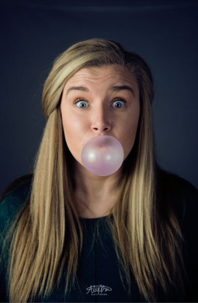
BUBBLE TROUBLE
I’ve always envied those people who are able to blow bubbles with their bubble gum. I’ve tried so many times but can never seem to ever get it to work. Thankfully Ashley Morin can do that! This is a great and fun way to take a boring studio portrait and make it pop. pun totally intended! According to Ashley, the best type of gum to blow bubbles with was my childhood favorite, Hubba Bubba. Even if you can’t get some Hubba Bubba, any gum should work but you might need to go in photoshop and do a selective color adjustment to increase the pinks like I did with this shot. Another thing that I must stress is to make sure the model maintains a good expression!

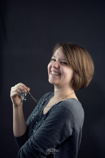
THE NATURAL
I love this picture of Jill Weaver because I love how she was herself in front of the camera. I believe we were actually waiting for someone to bring us something, so I was trying to make her laugh (something I love to do with models) and she was just playing around with her necklace. When it comes to portrait photography whatever is closest to the camera will look larger. When I look back at this picture, I love the expression, however, I wish I had her bring her shoulder back just a bit that way it’s in proportion with the rest of her body. THe other thing I absolutely love about this picture is the motion that is in her hair. By instructing her to tilt her head back a little bit her hair becomes something more to this fun studio shoot!
If you want to see some more ideas of fun studio shoots, take a look at this family photoshoot by Townsville Photography Studio.
by Alex Brown | Mar 15, 2017
No matter how much you hate each other, show people that you’re in love with a couples mini session.
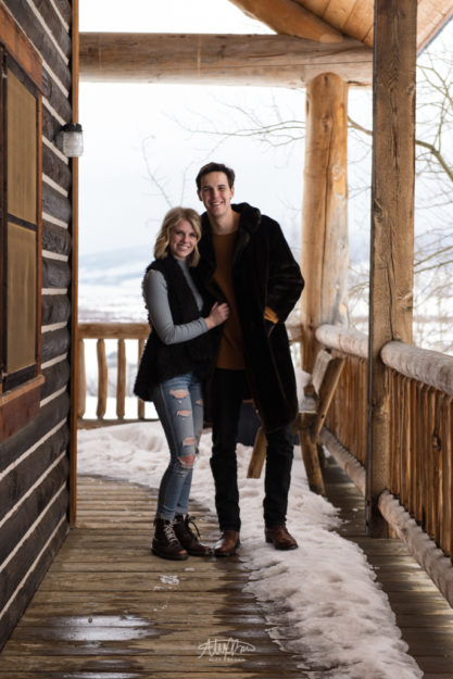
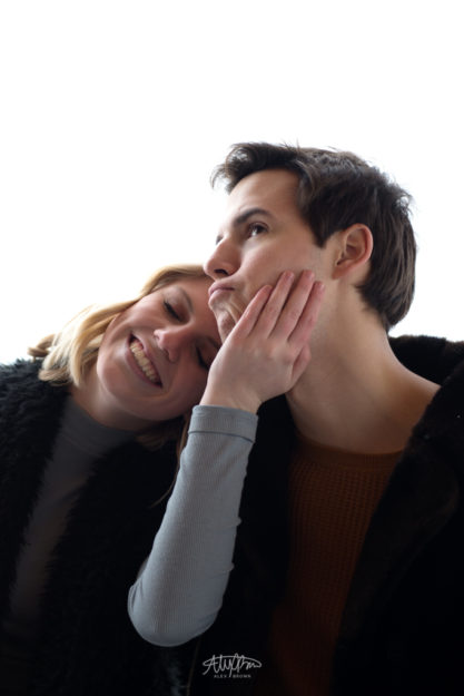
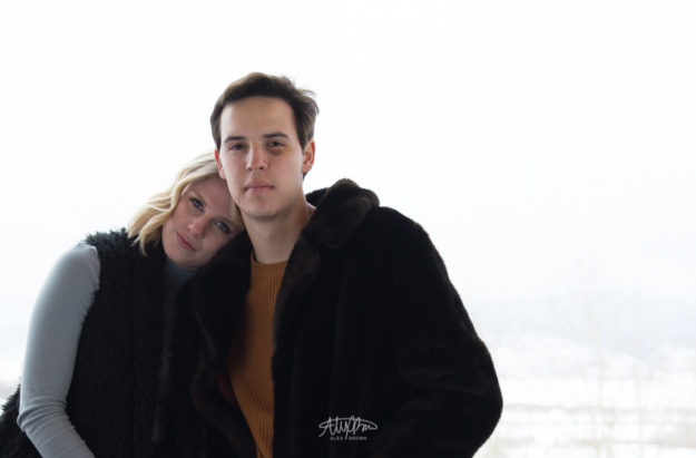
I’m going to be flat out honest with you right now: Sam and Emma are not dating. Or married. Not only did I link to their websites to increase SEO interaction, I want you to see their awesome work!

Photographing couples, whether engaged or married, is always a fun task. Whenever I photograph engagements or do couples mini sessions I always start by telling them how I’m different from other photographers in the fact that I dont heavily believe in posing and directing. I think the best photos are those that show natural expressions and capture the goofy moments like this one below. A week or so ago, I actually watched a Lindsay Adler workshop and it was interesting to see how strongly she believes in this similar method – letting people be natural then turning a pose into that.


Just as much as these too love each other (or not), I love shooting couples! If you ever are interested in a full shoot or even a couples mini shoot, feel free to send me a message on my contact page. I would love to hear from you and even more work with you!


 Helaman in this picture looks like John Mayer. While I can’t remember if he actually played the guitar, I do remember this lighting was AWESOME. This is a great example of the Rembrandt lighting pattern. I love his pose, the direction of the light and the overall environment. This Idaho portrait would be the perfect cover for a country album!